Case study
- Intervention and artistic residency, Workshop
- espace 36
Aperçu avant impression (Print preview) — A residency focused on an art centre’s archives
Background
In 2019, espace 36 began a new cycle of annual creative residencies dedicated to supporting graphic design. As part of this initiative, we were invited by the espace 36 team (Benoît Warzée, Ségolène Gabriel and Marina Grebert) to produce a work of art, which we presented in January 2020 as part of a final exhibition.
We used the 20th anniversary marking the renewal of the association’s project as an opportunity to delve into the history of the space through an exploration of its archives.
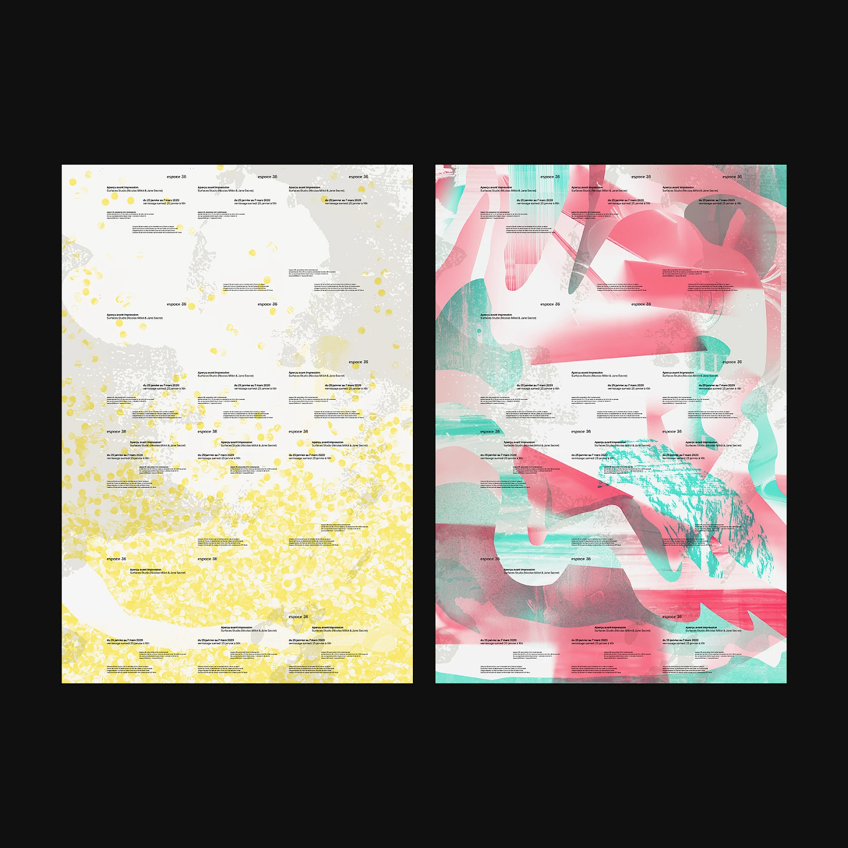
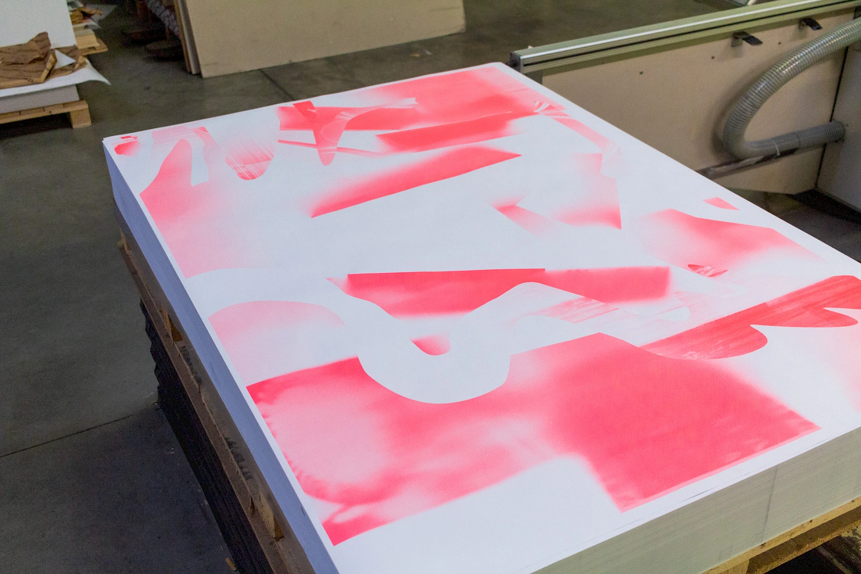
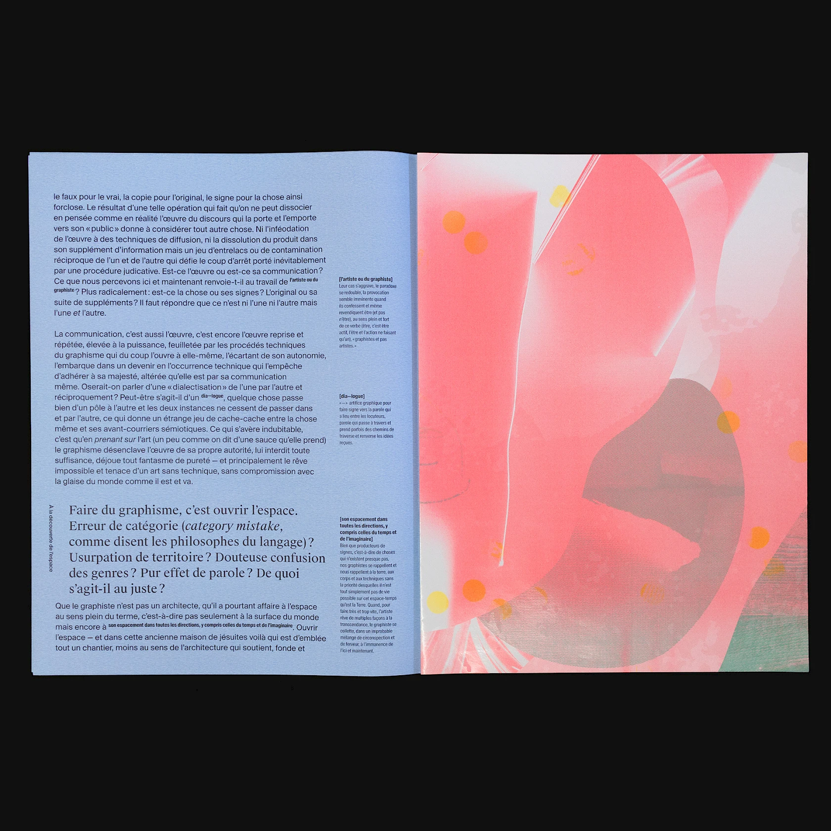
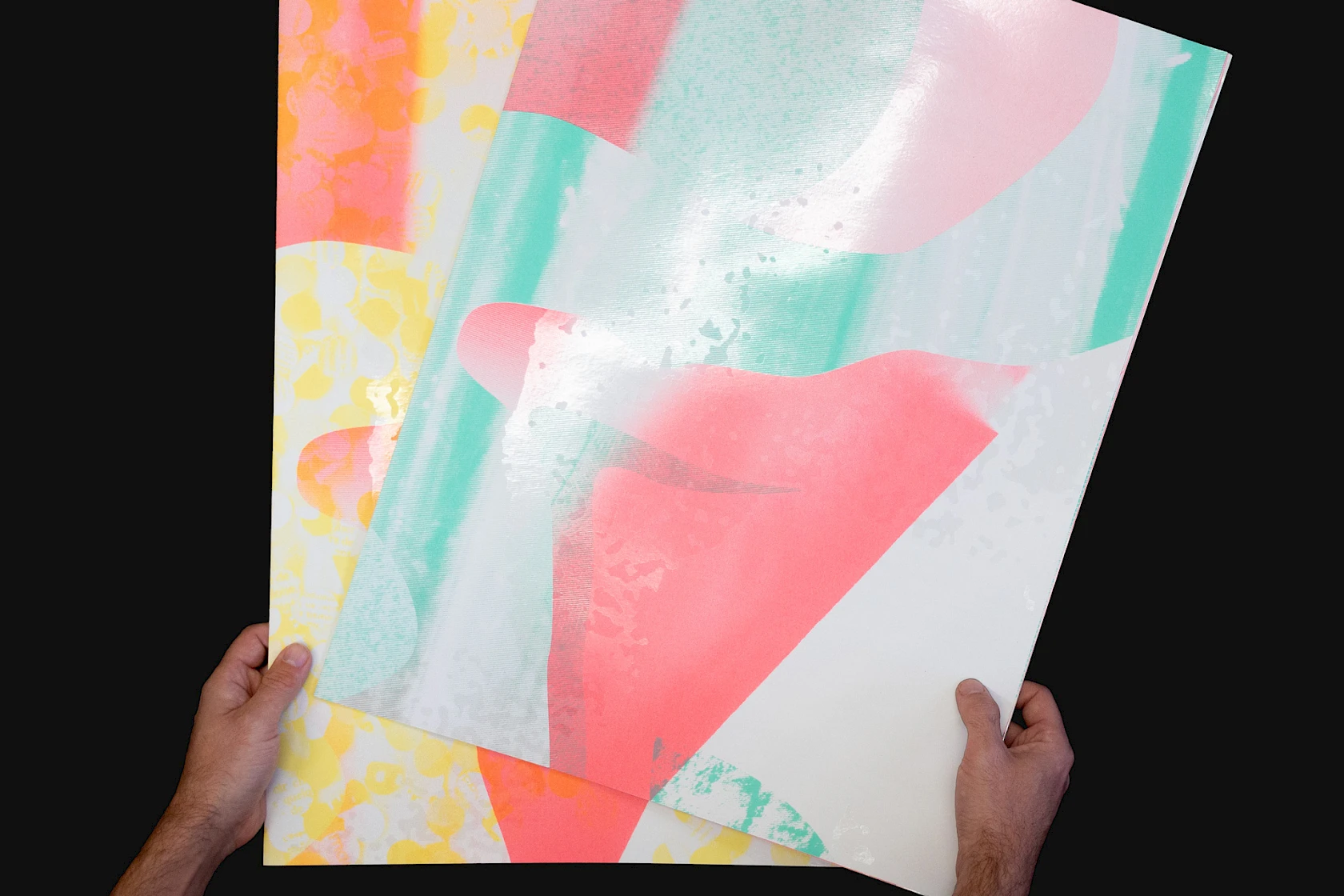
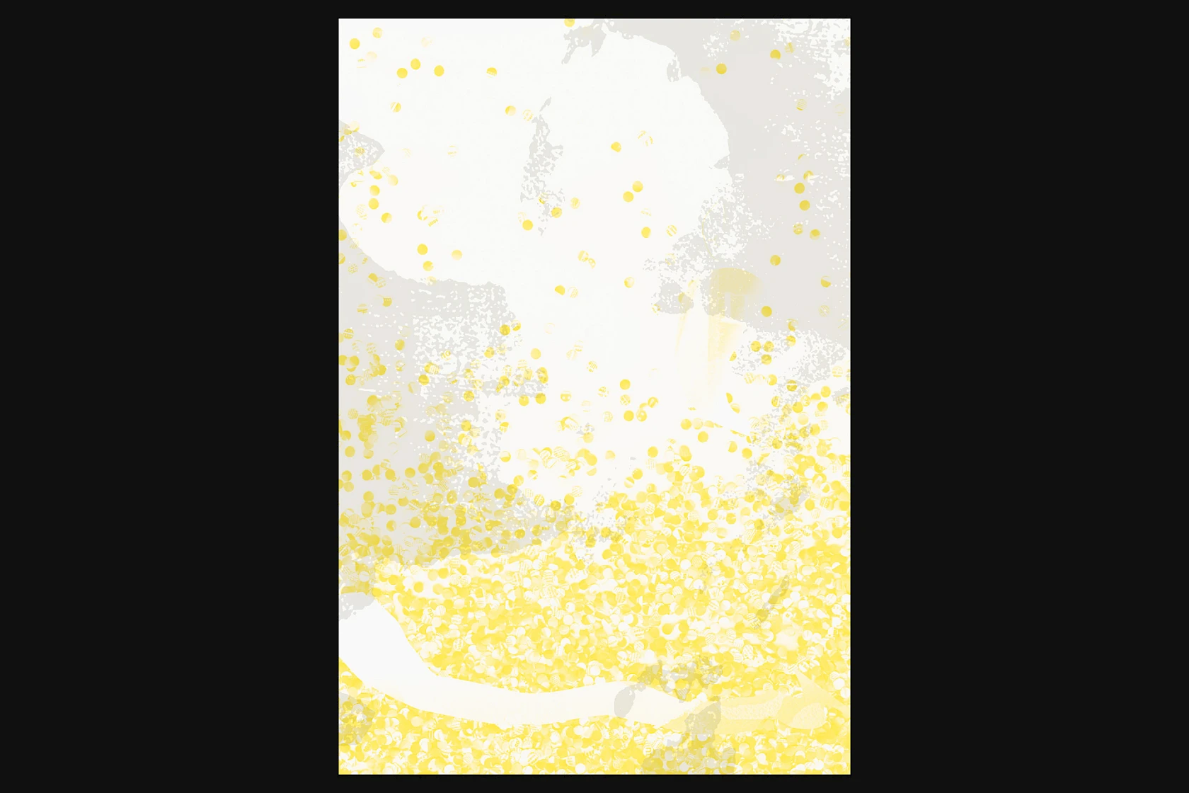
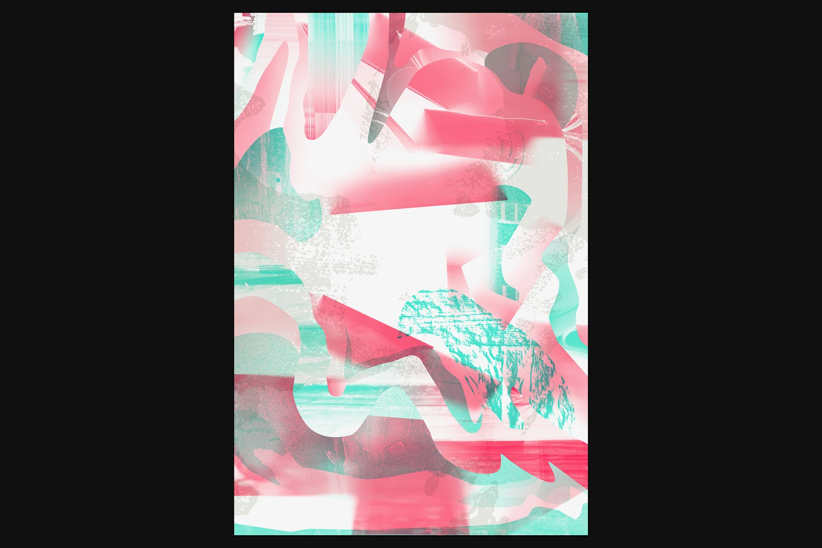
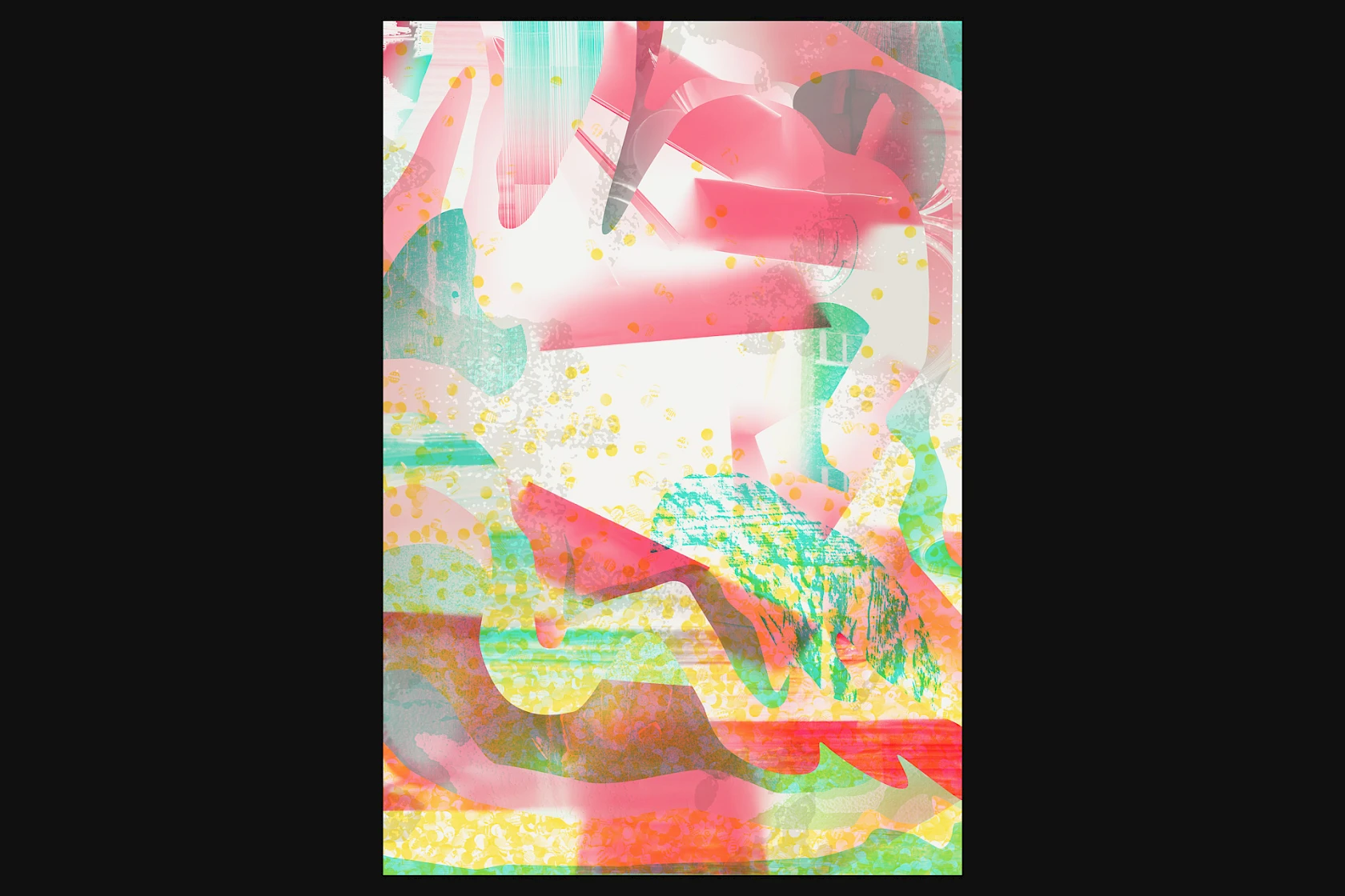
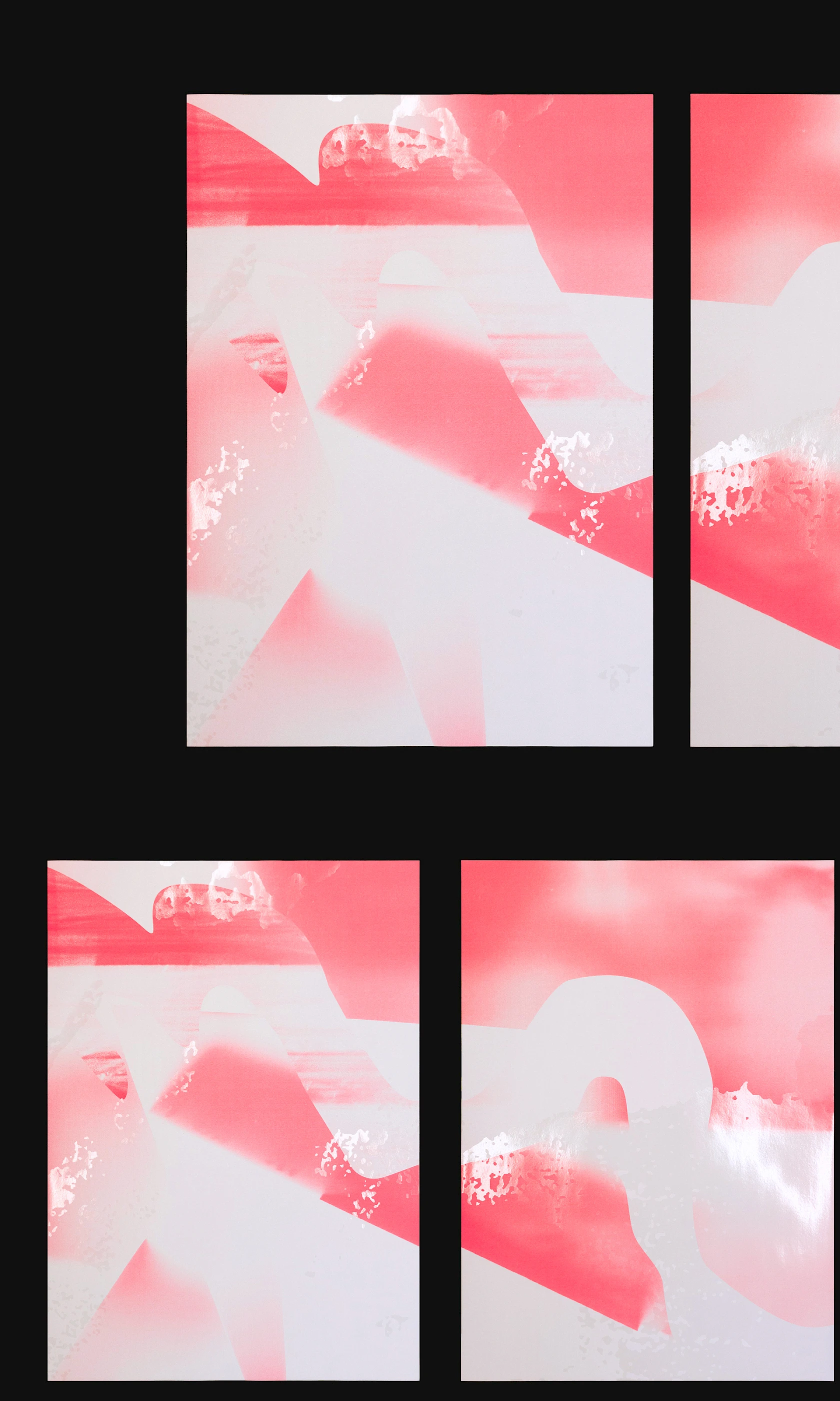
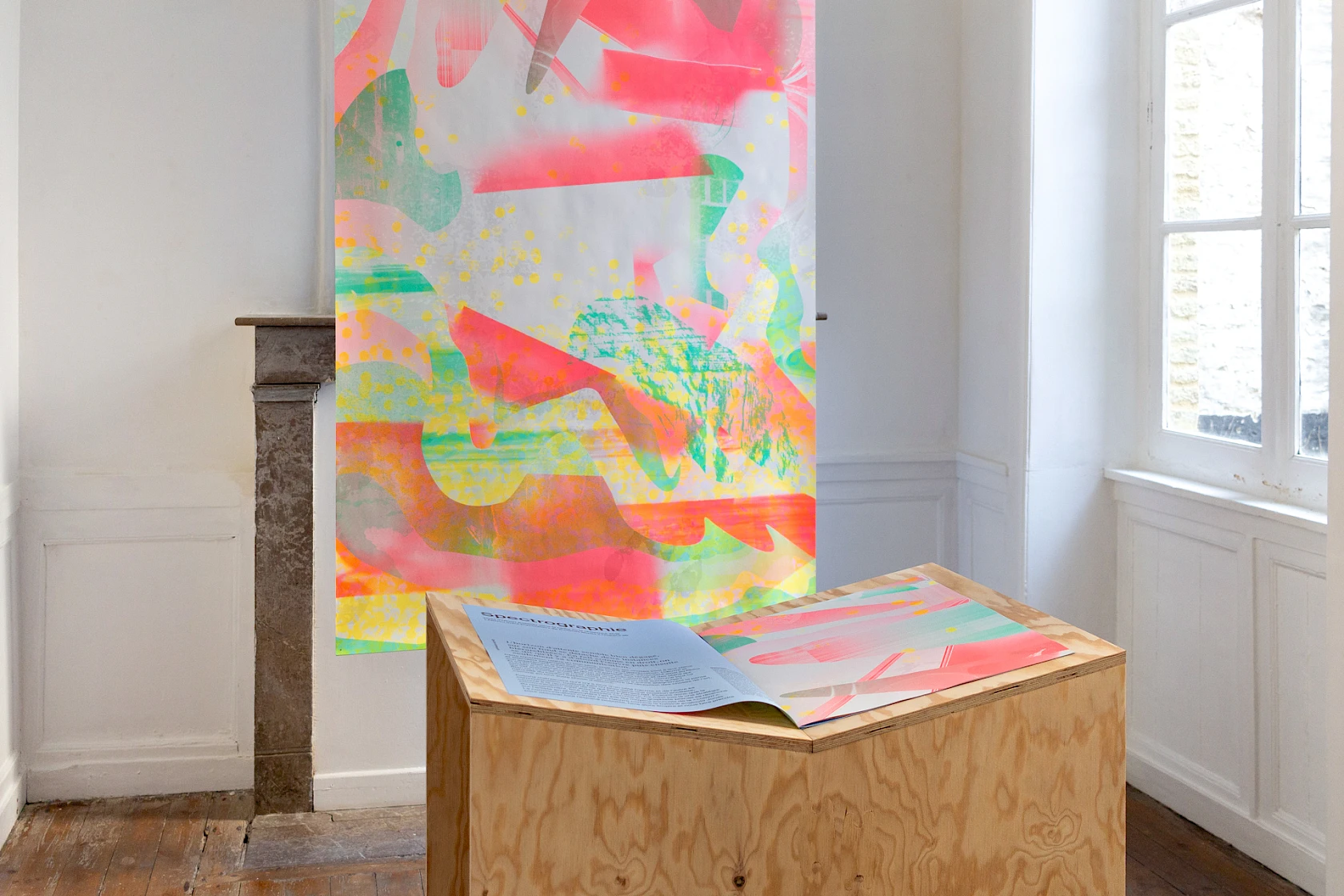
This research led to the creation of a poster (118.5 × 175 cm)—a matrix for a large-format edition, a series of posters, and all the communication documents—composed of layered memories from the venue with the intuition that the piece of art and its communication are merely extensions of a unified whole.
As is often the case in our approach, the production process complements and supports this reflection.
A work of art as a matrix
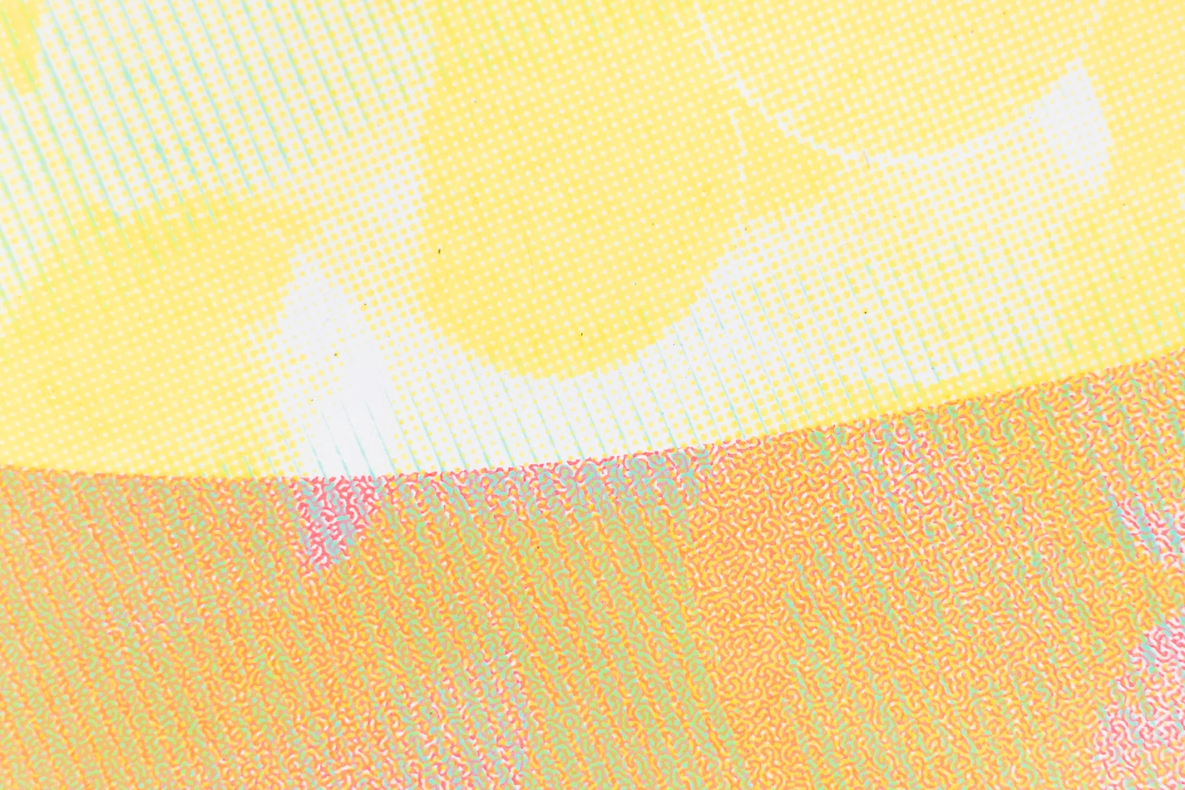
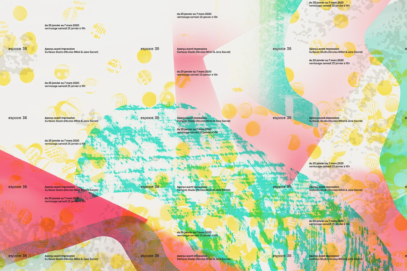
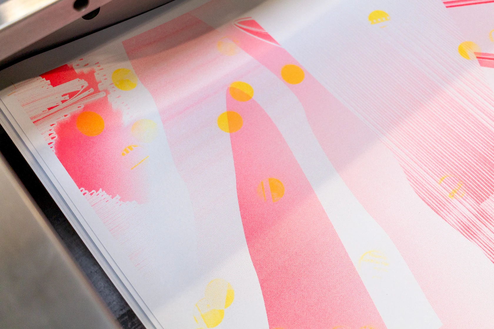
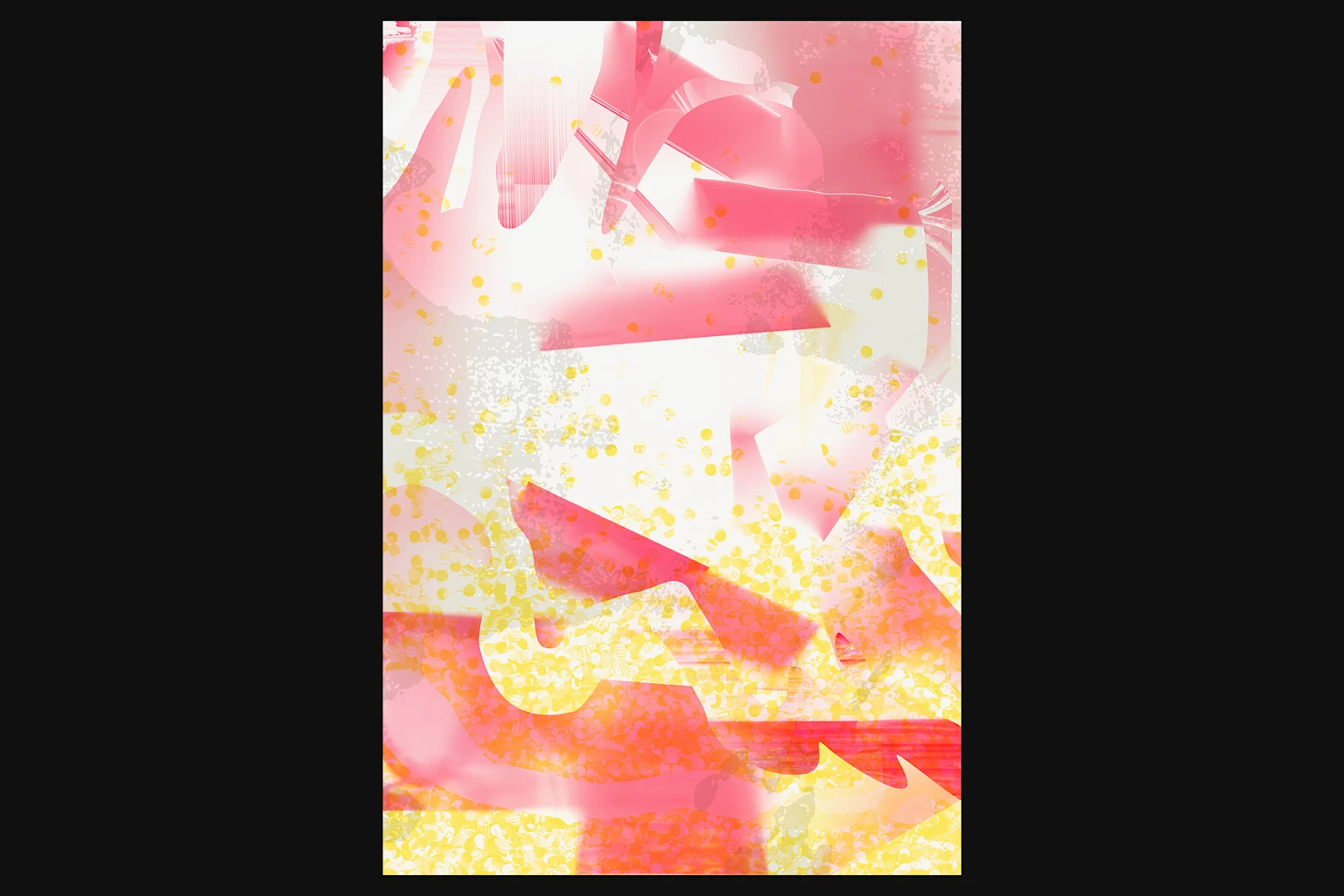
Layers of ink and halftone patterns used for the matrix (118.5 × 175 cm) of the work.
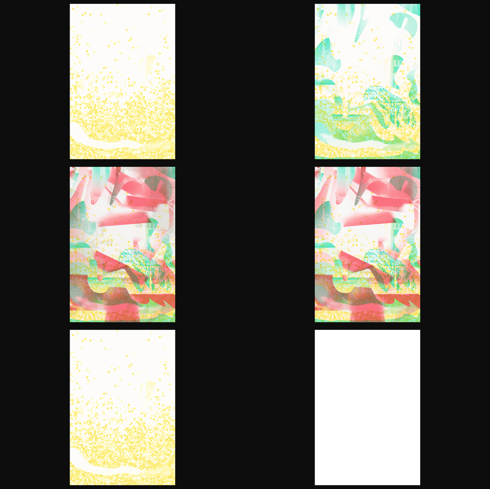
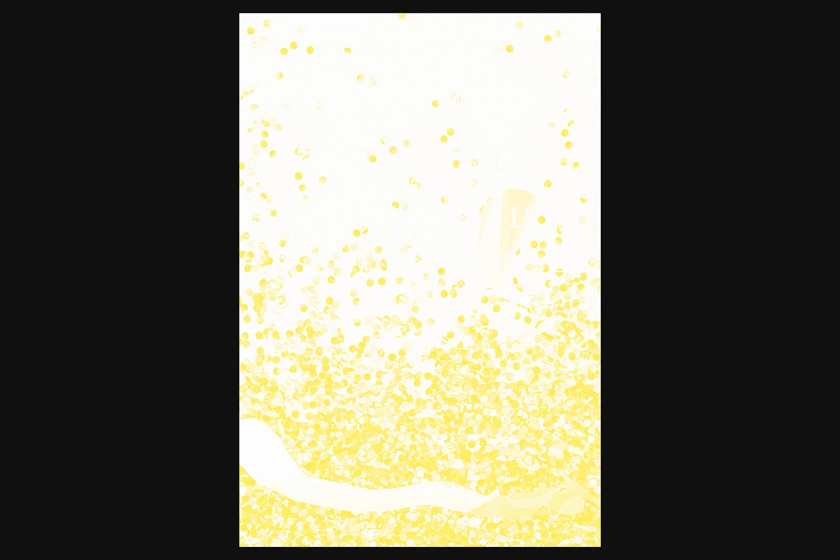
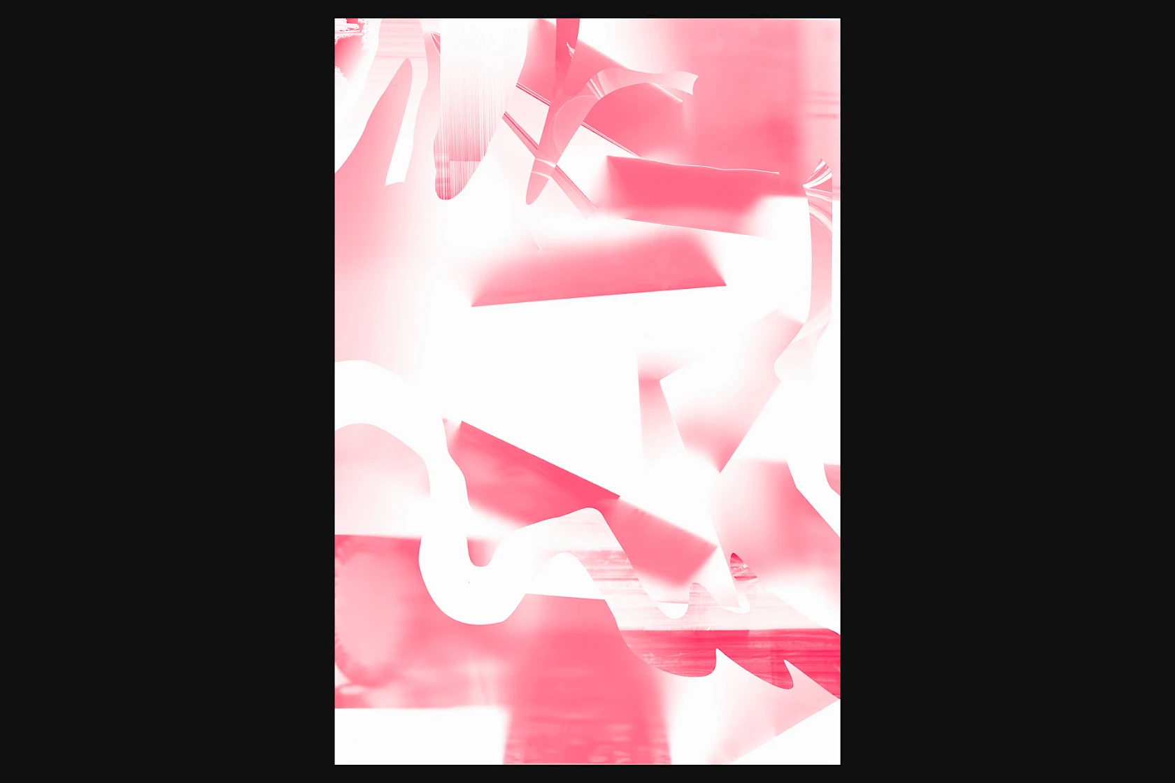
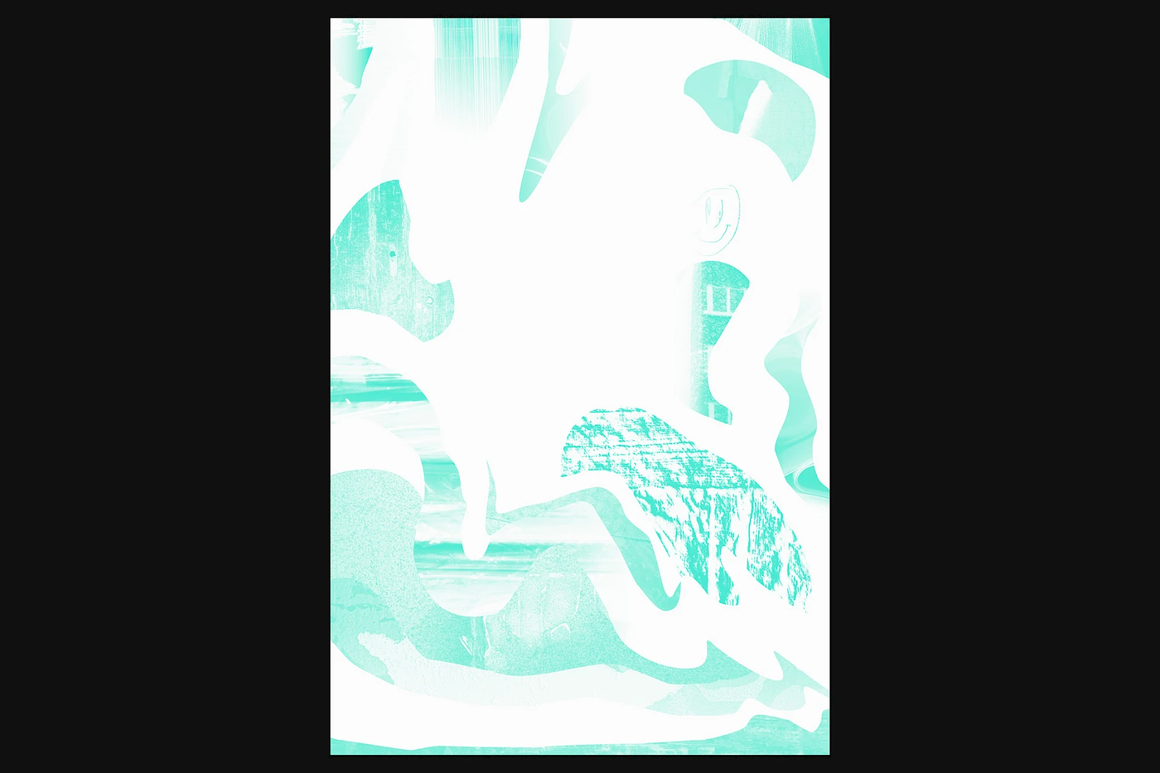
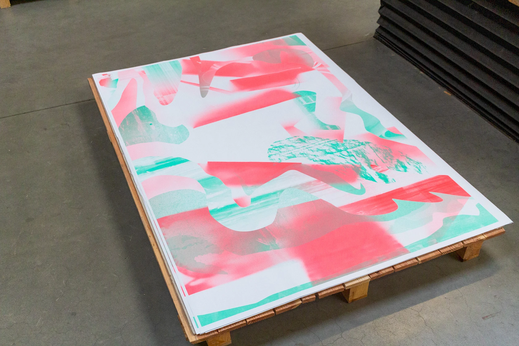
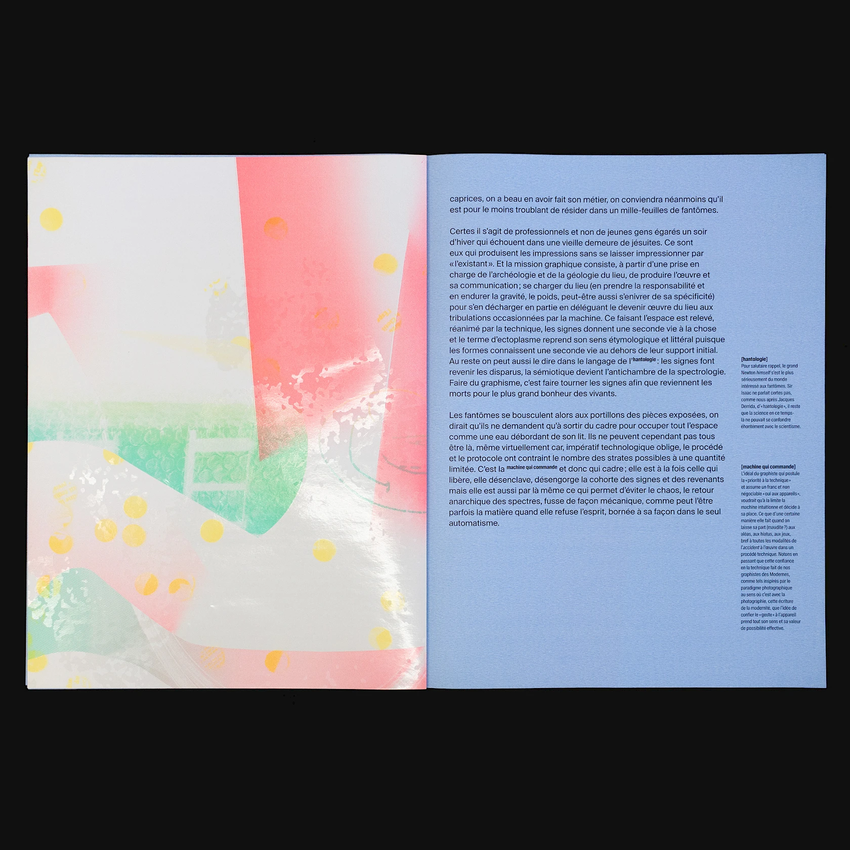
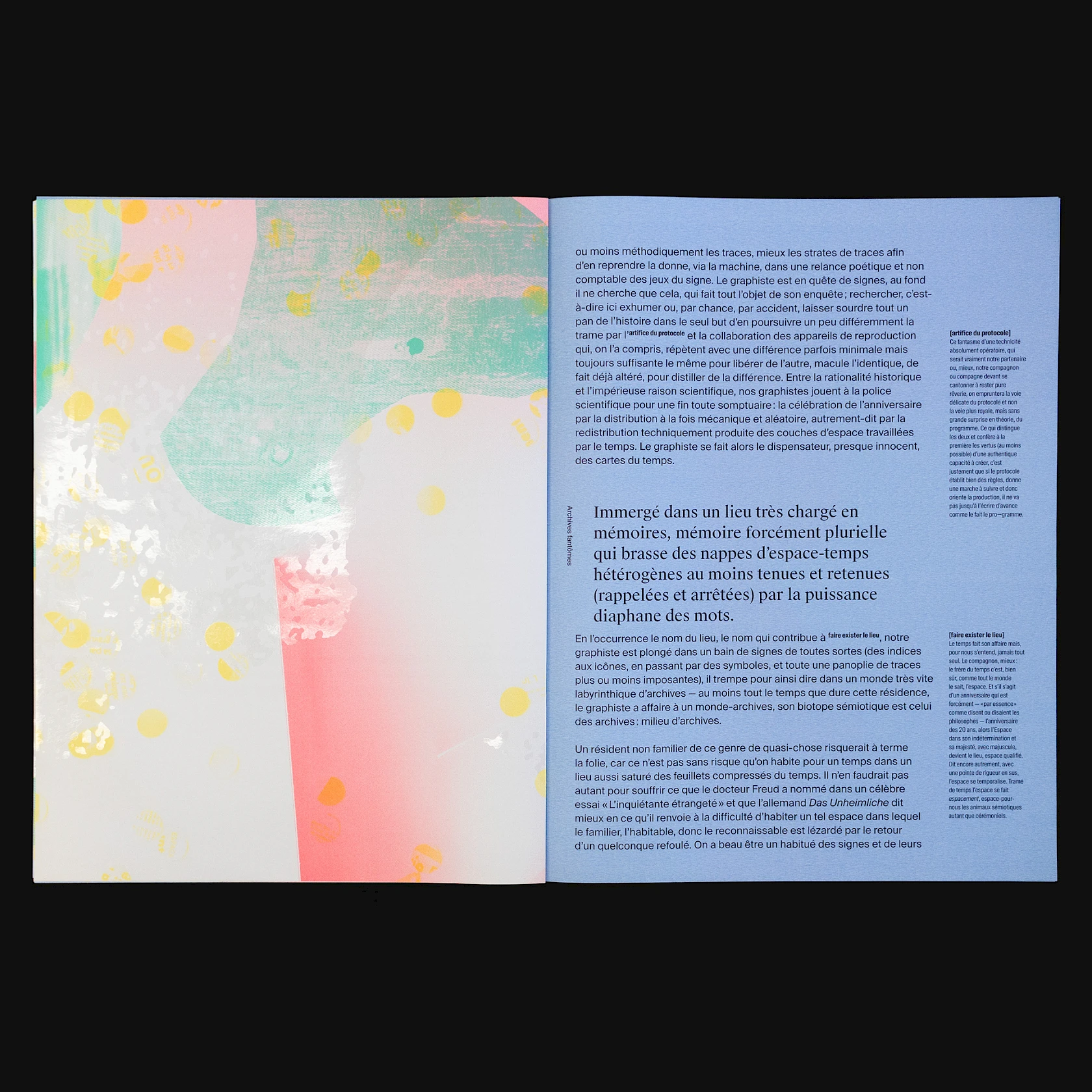
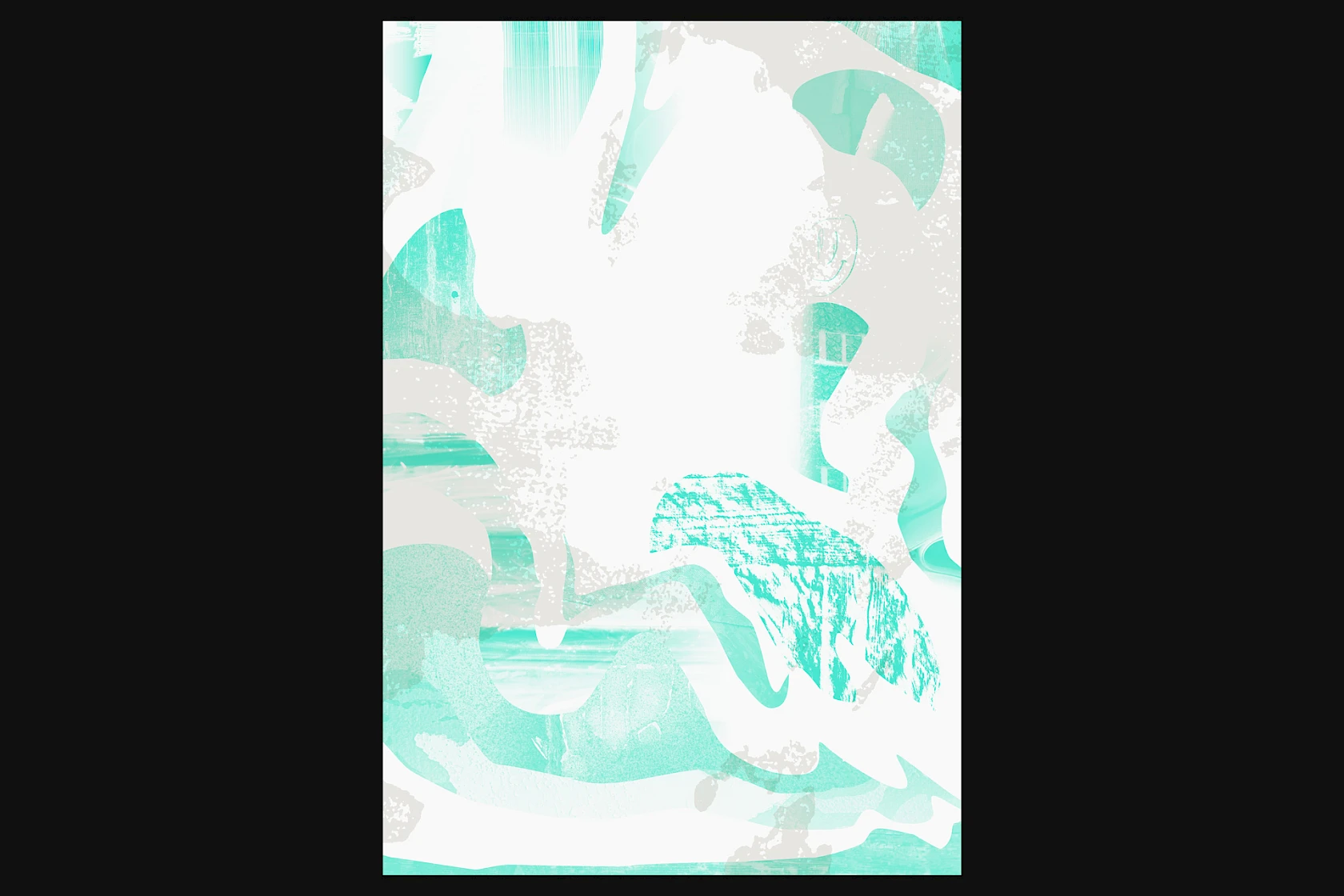
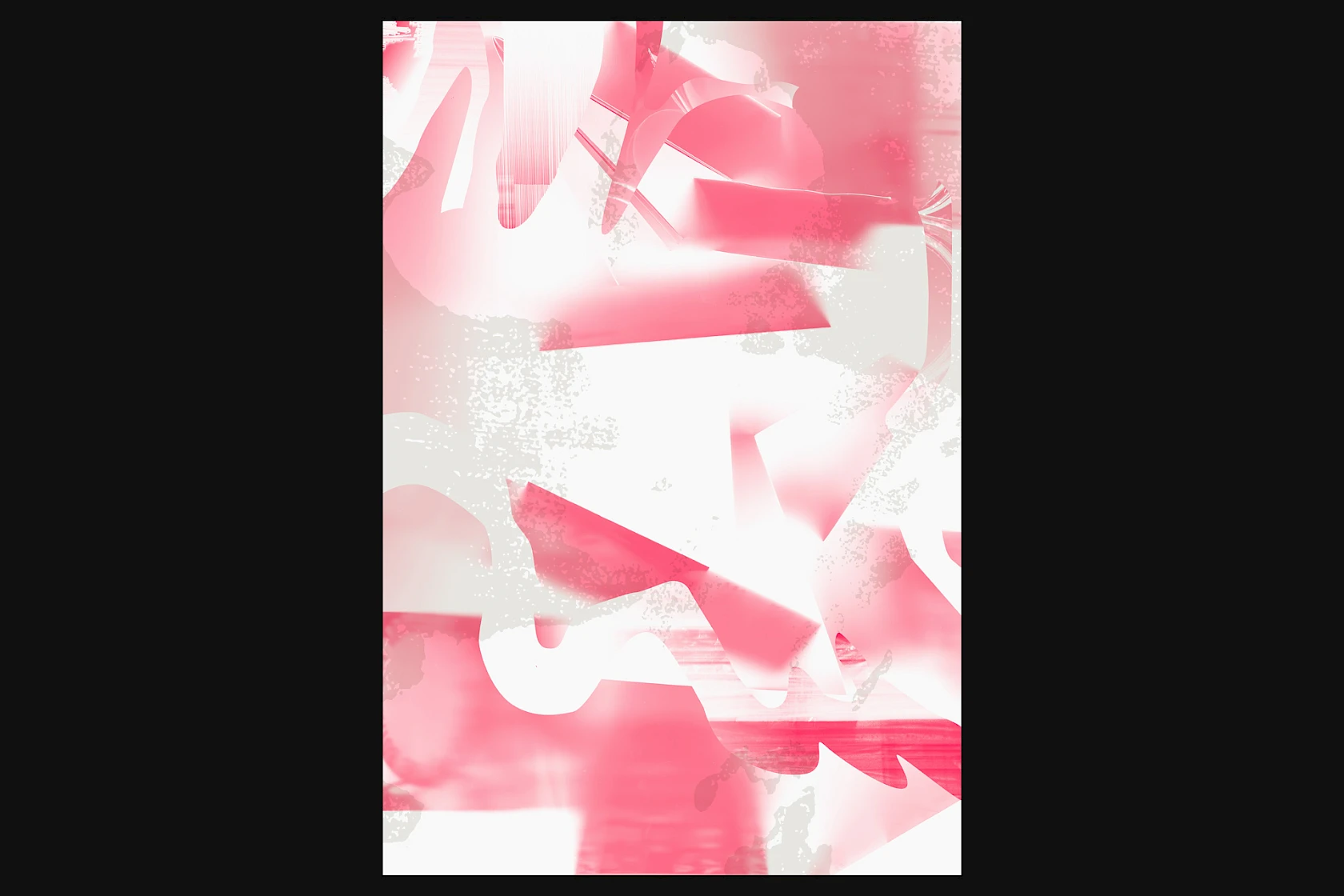
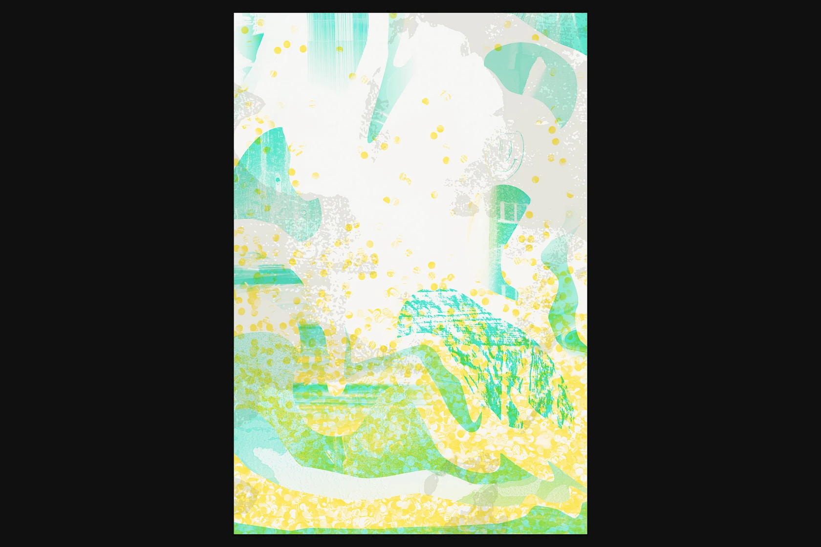
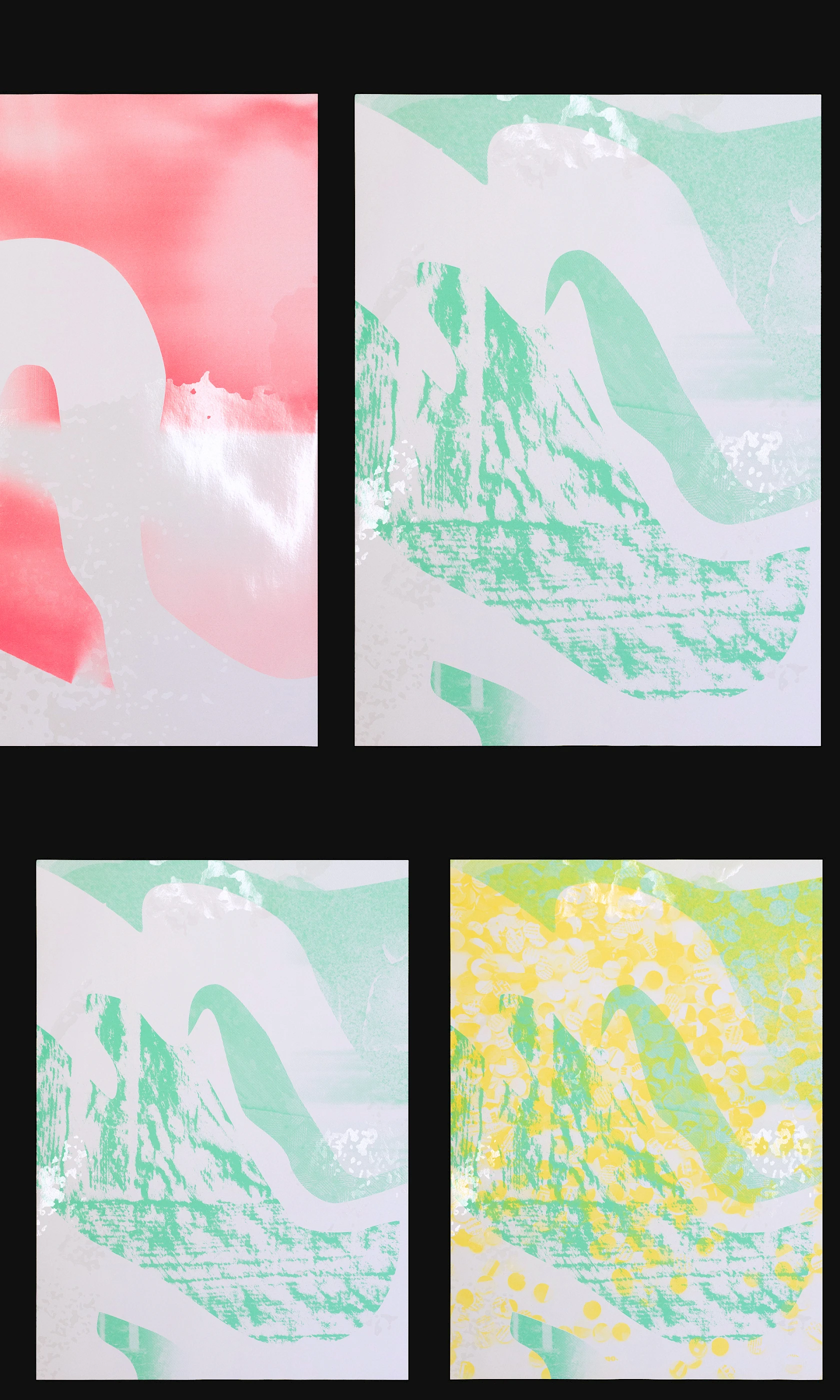
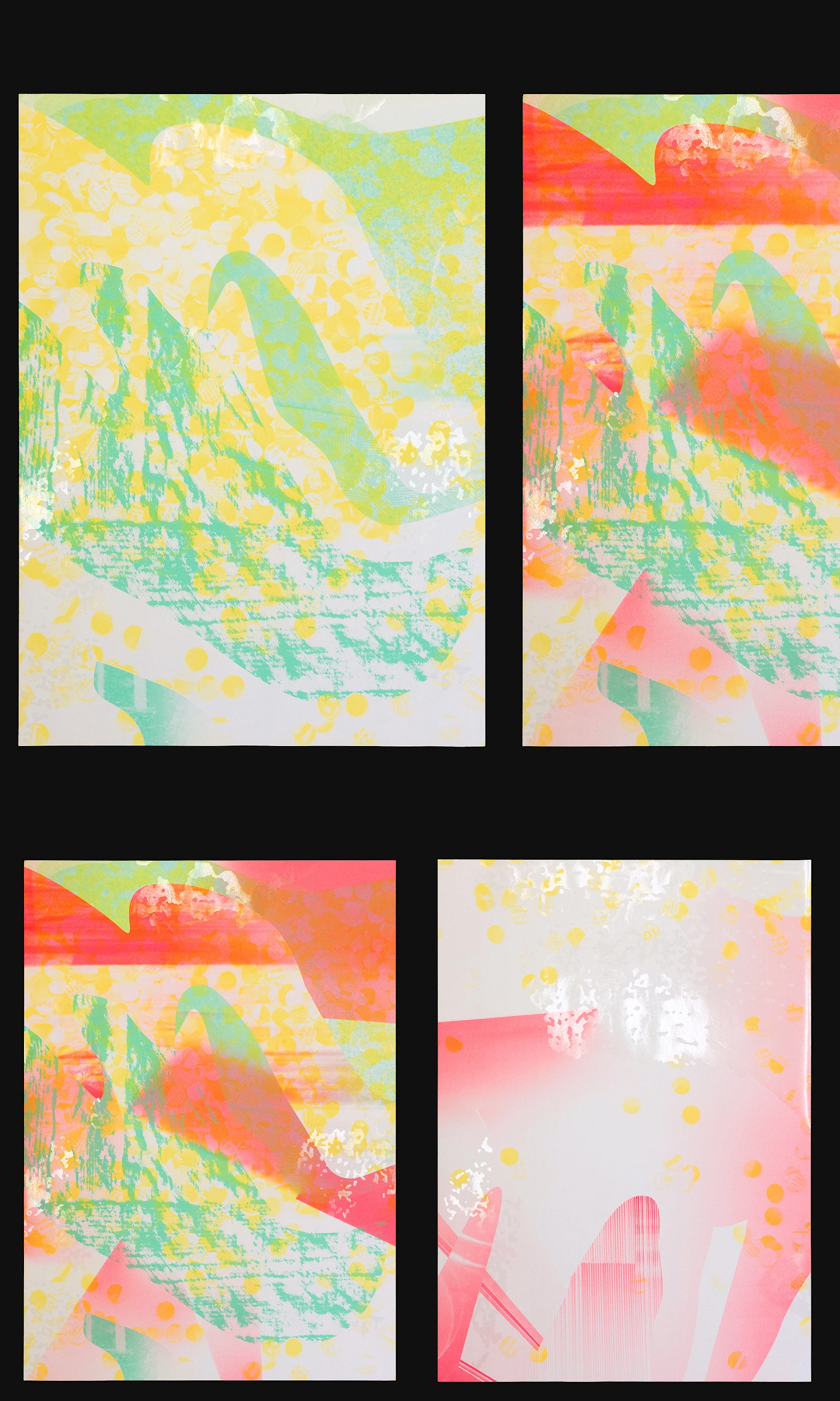
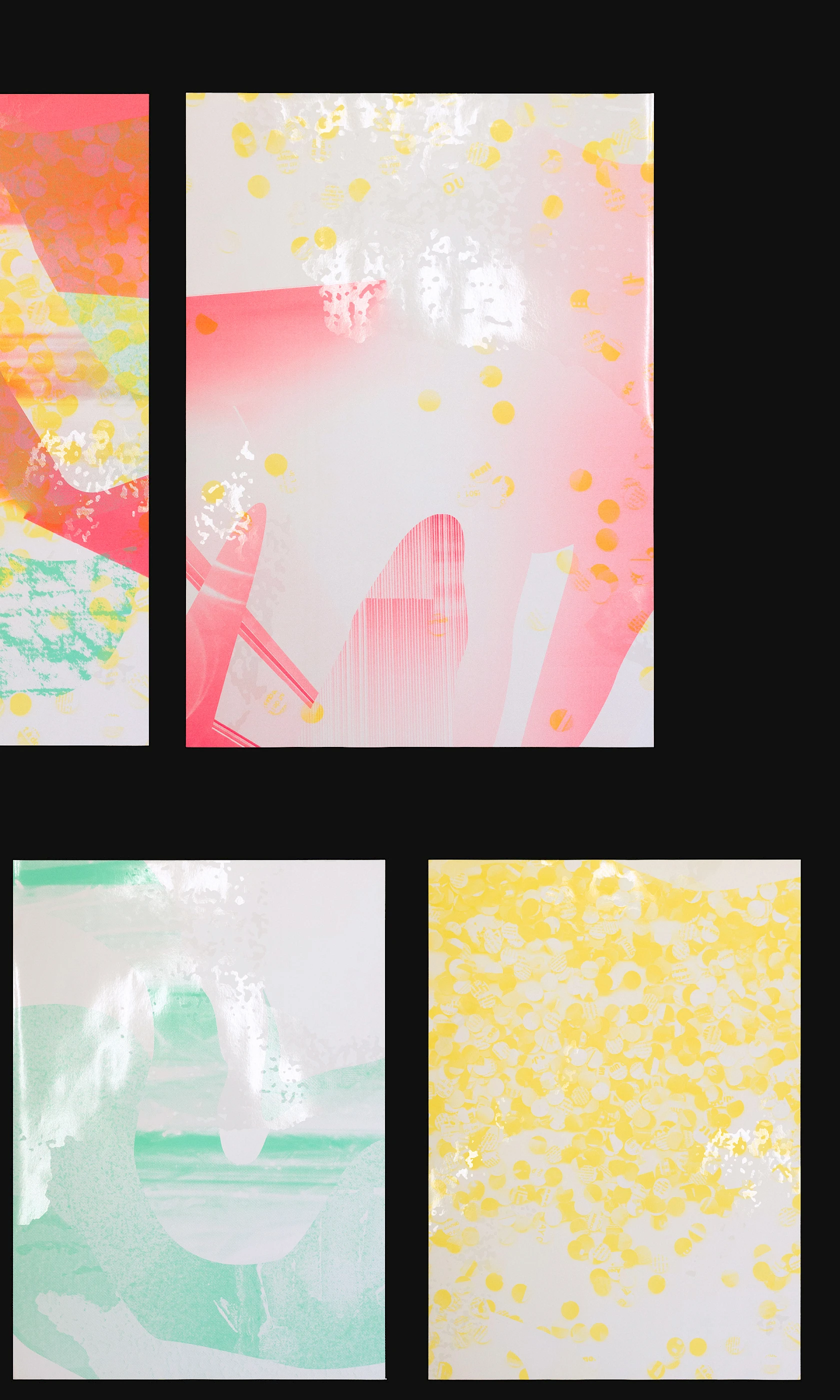
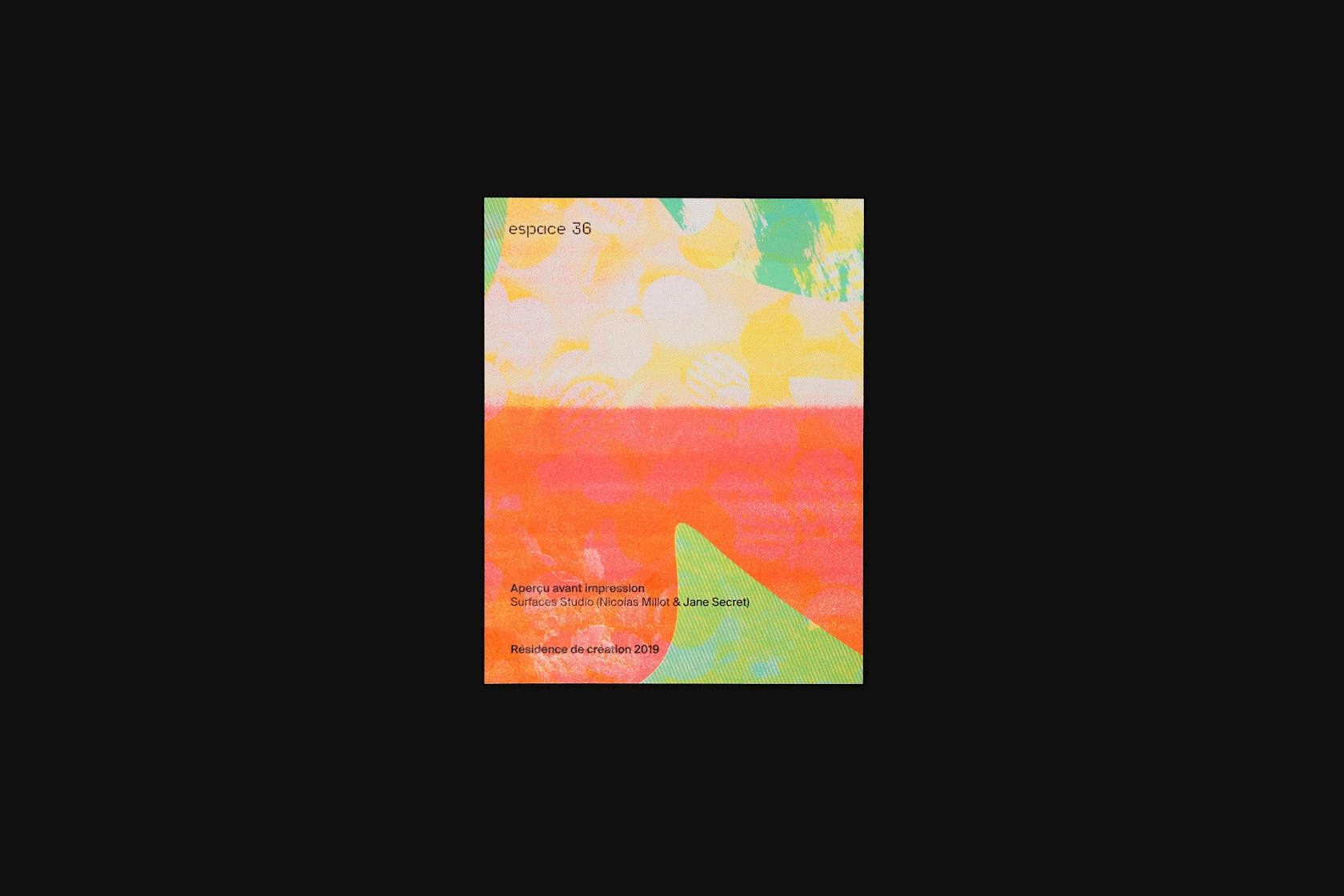
After conducting this research in the espace 36 archives—and in order to gain clarity—we decided to work with data layers. Each colour corresponds to a type of document.
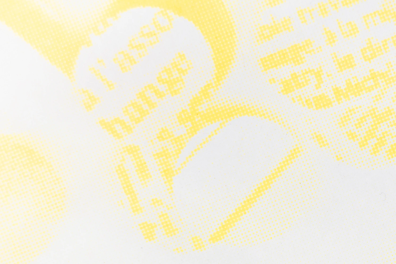
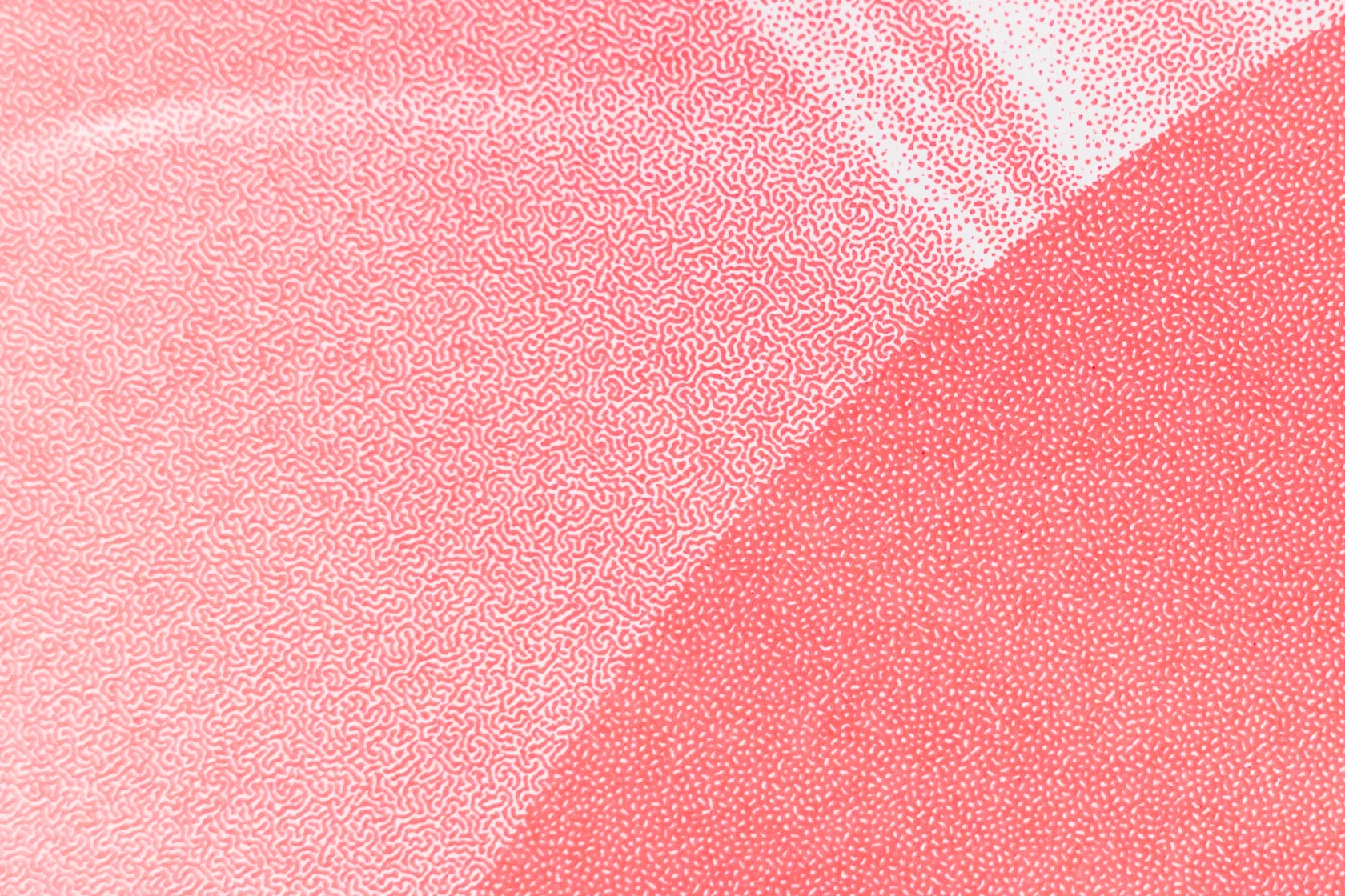
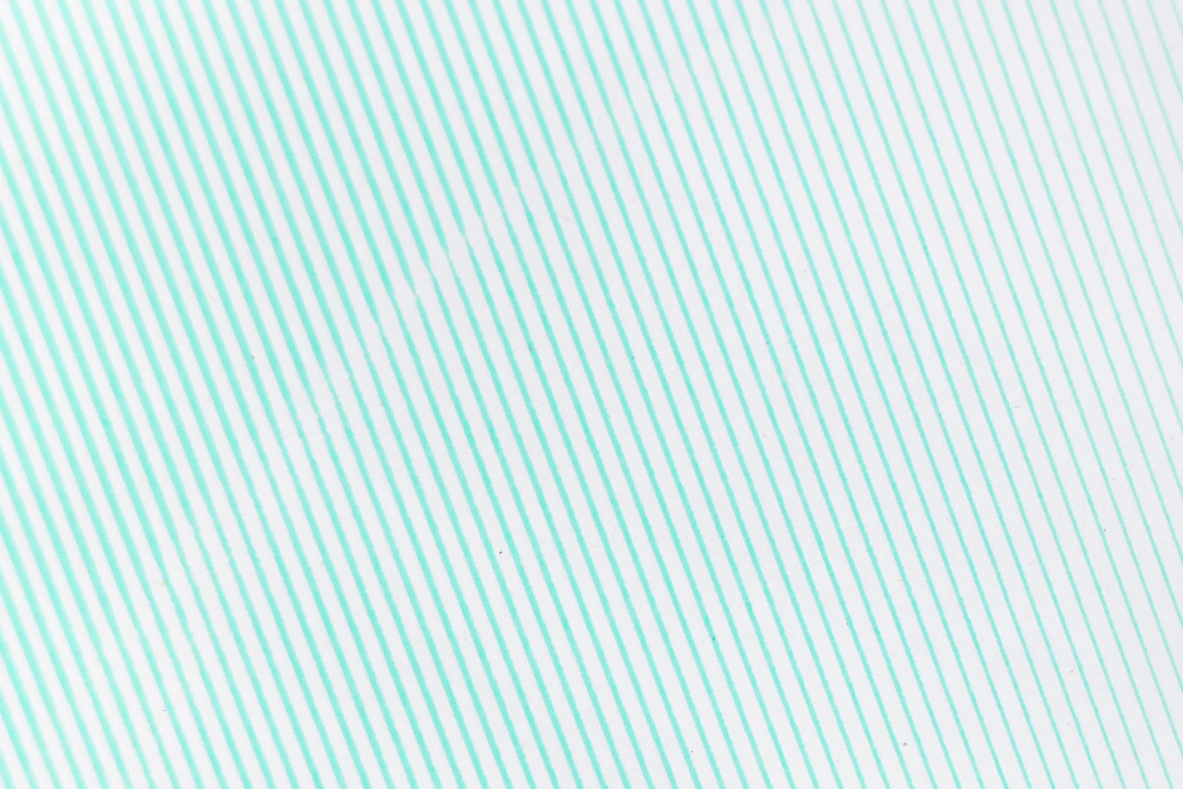
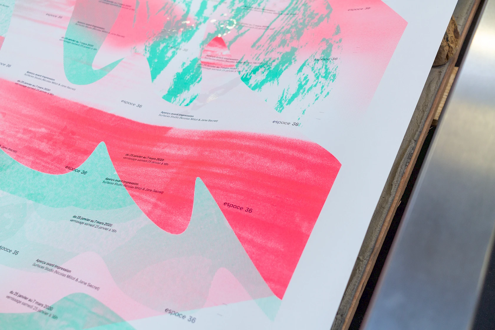
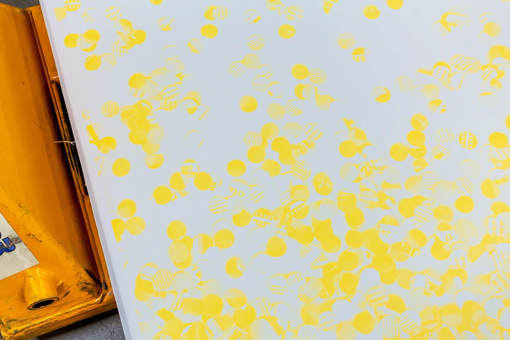
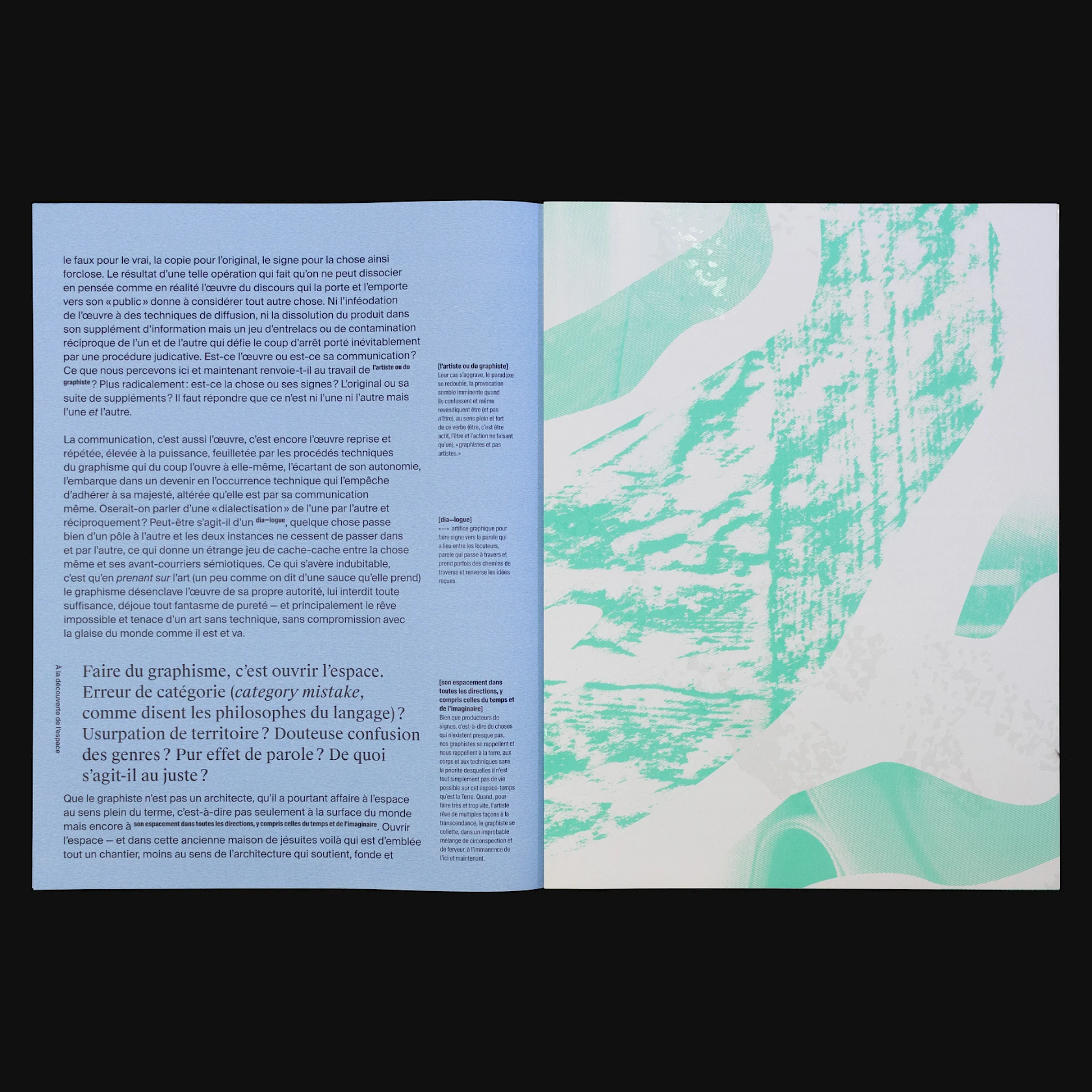
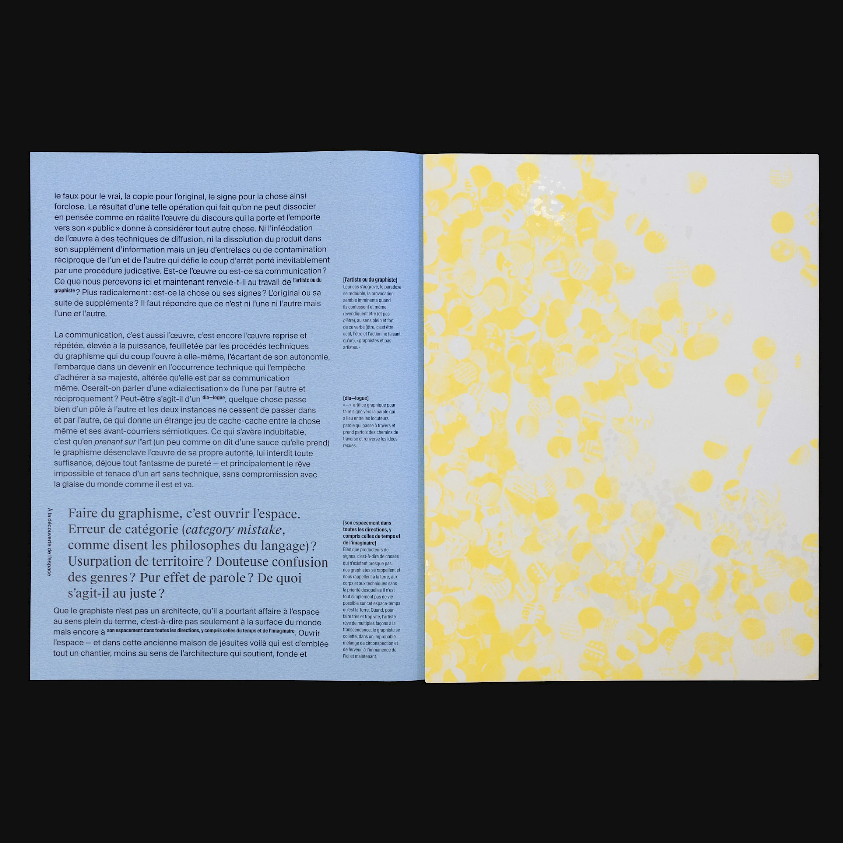
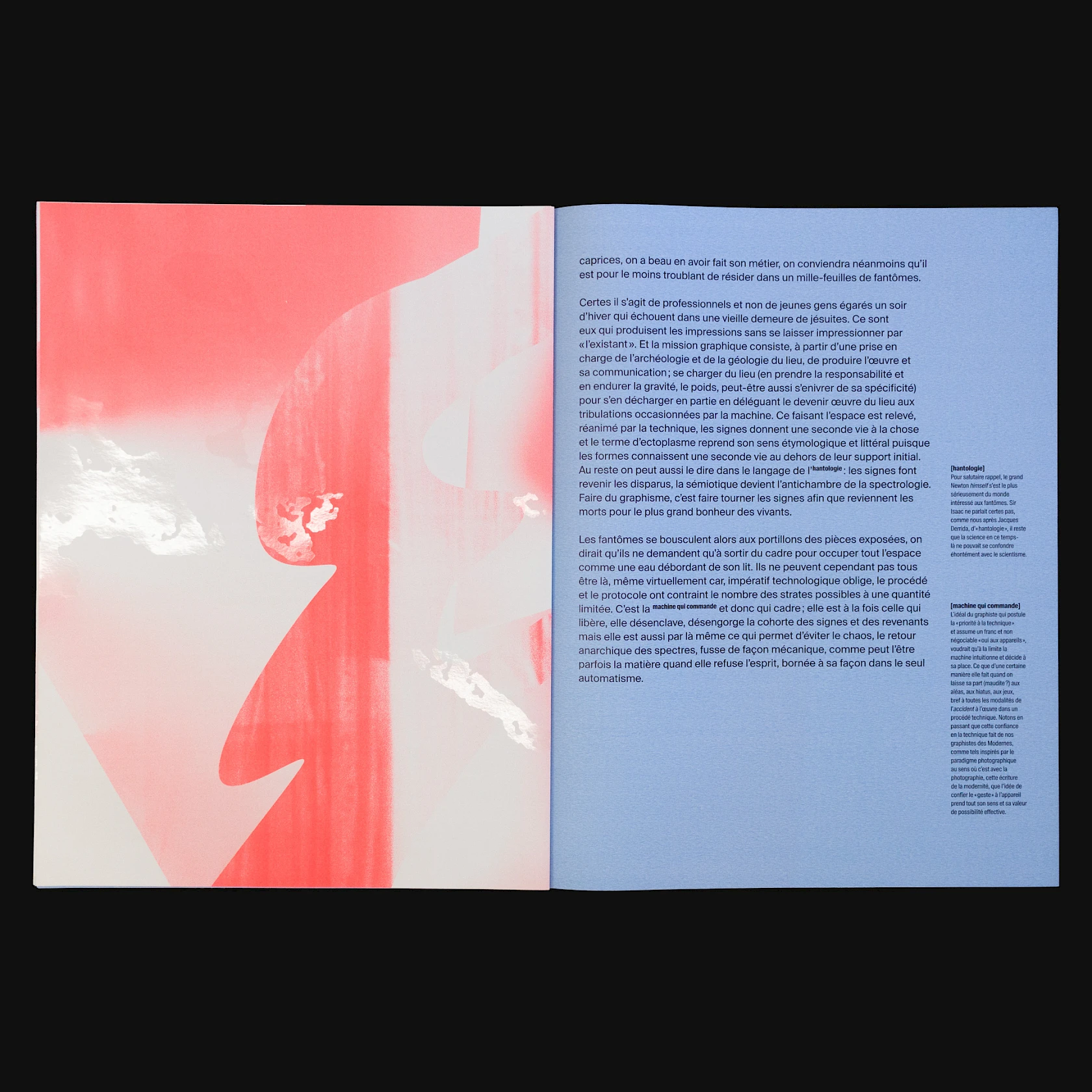
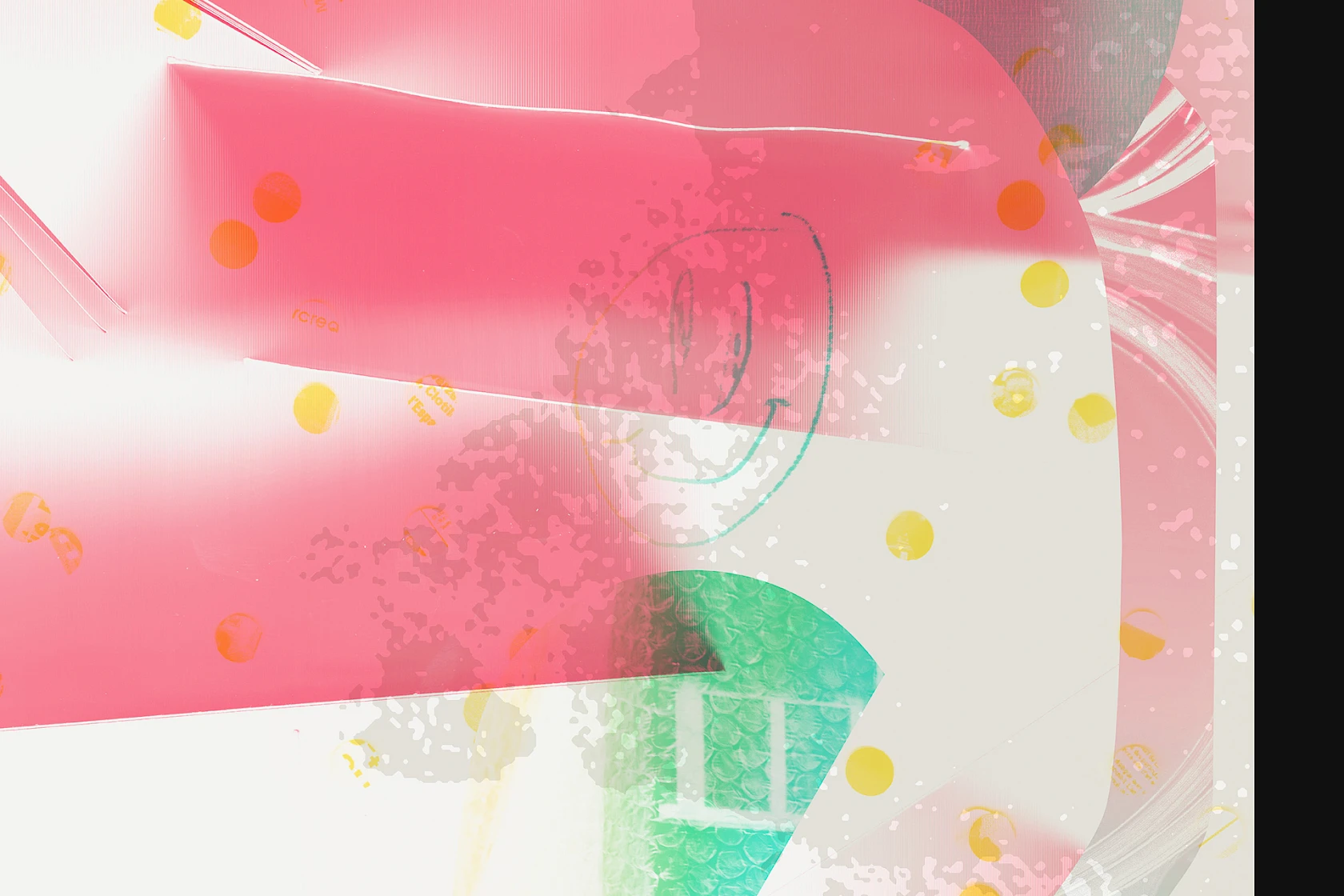
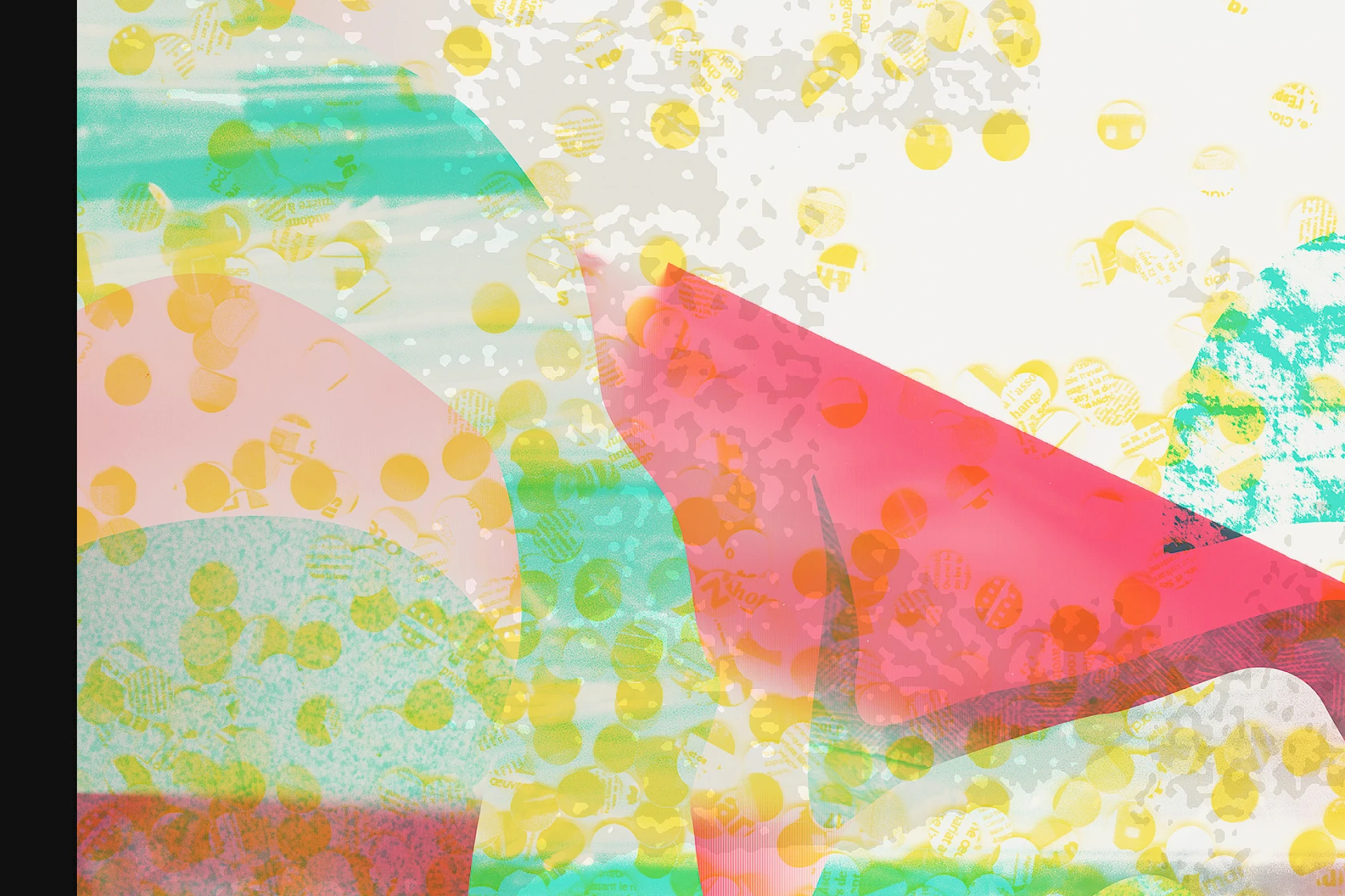
Fluorescent yellow refers to indirect archives (newspaper cuttings, blog articles, etc.). Magenta is based on the communication elements produced by espace 36, highlighting the plasticity of the documents themselves (folds, pagination, volumes, formats). The pastel green reflects a photographic report that we shot on-site.
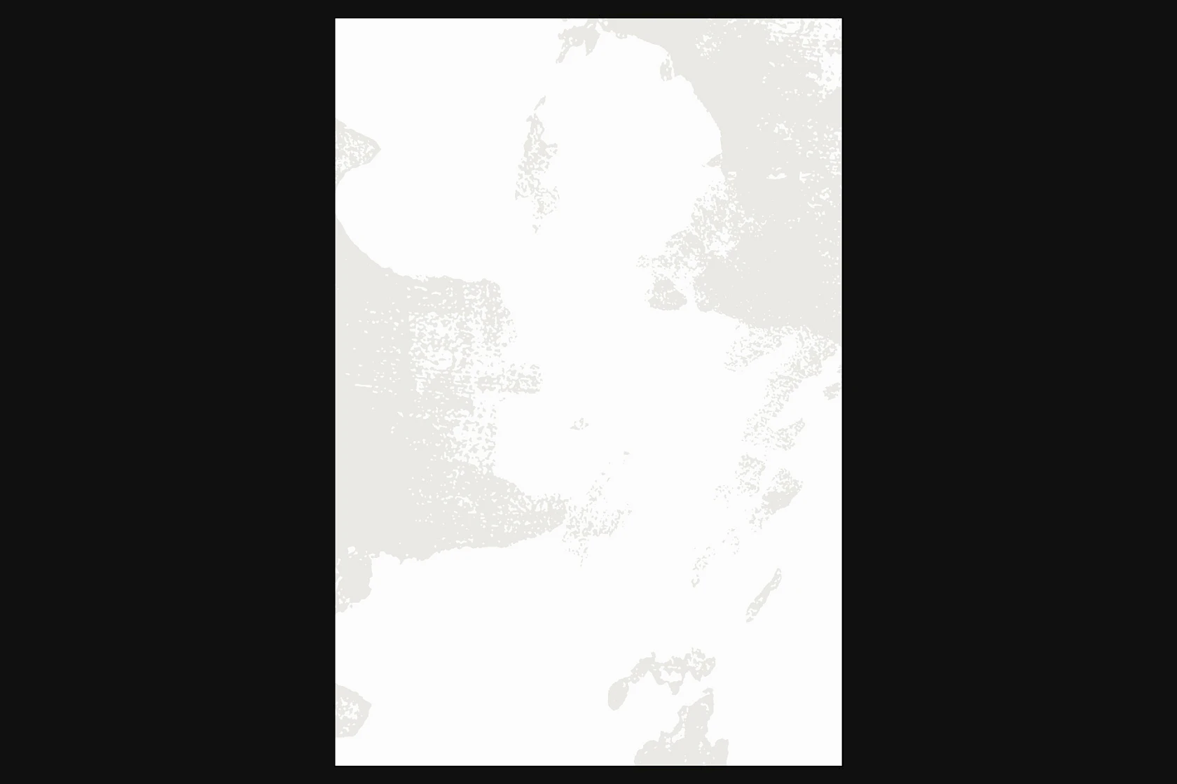
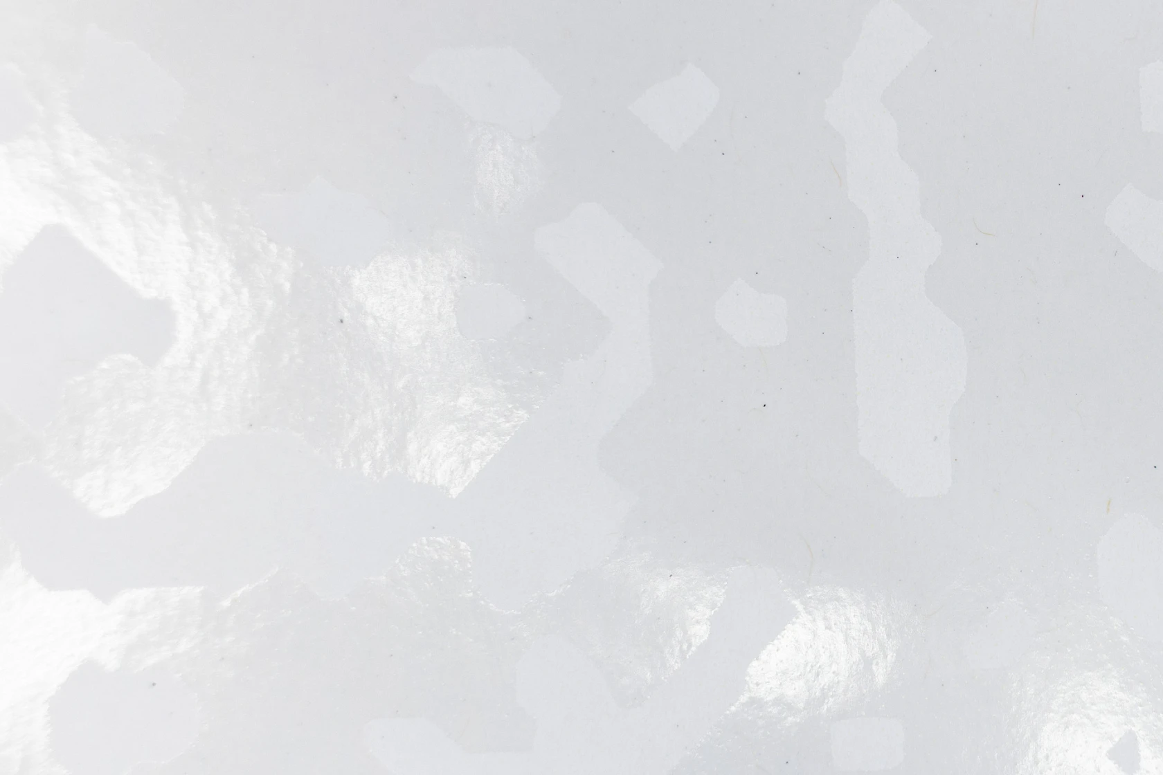
During one of our visits, as a photograph by the artist Catherine Duverger was being removed during the unhanging of her exhibition (Les relations urbaines, 30 March to 27 April 2019), layers of paint came off with it, revealing an old wall painting by Janusz Stega (De Kyoto à Saint-Omer, 17 March to 16 June 2007). We salvaged this piece and incorporated it into our matrix by adding a final ink: a varnish superimposed on all the colours. This ghostly image witnesses all the works that have passed through this space.
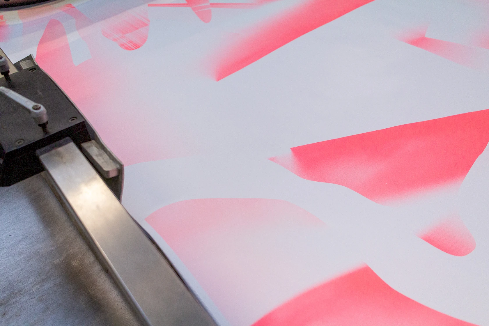
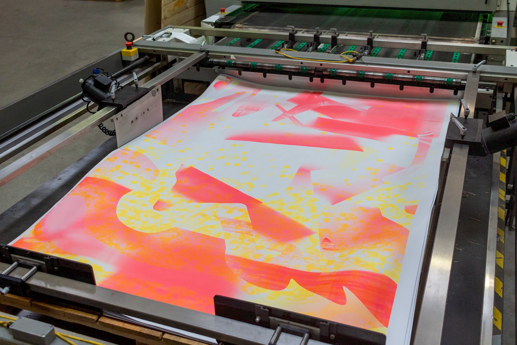
Opting to work in layers, we naturally turned to screen printing—a technique involving superimposed halftones and layers—with our long-standing partners at the Lézard Graphique workshop in Brumath.
To emphasise this relationship with the technique, we worked on a specific printing halftone for each type of shape. For example, we used a stochastic pattern to reproduce the gradients in the magenta layer, and a round pattern that echoed the formal language developed for the yellow layer. The oblique linear pattern of the pastel green completes the range.
Pragmatic overlay
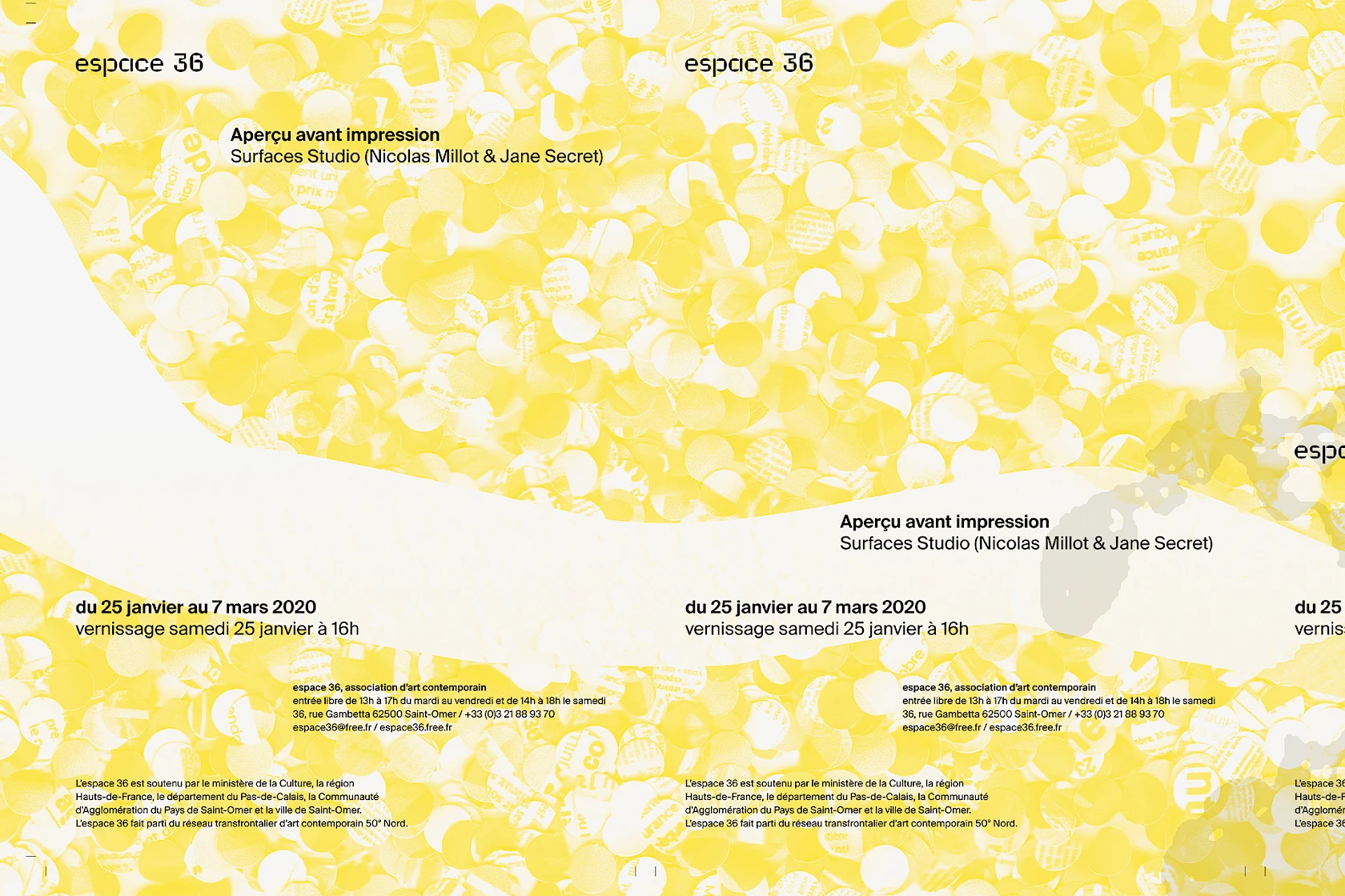
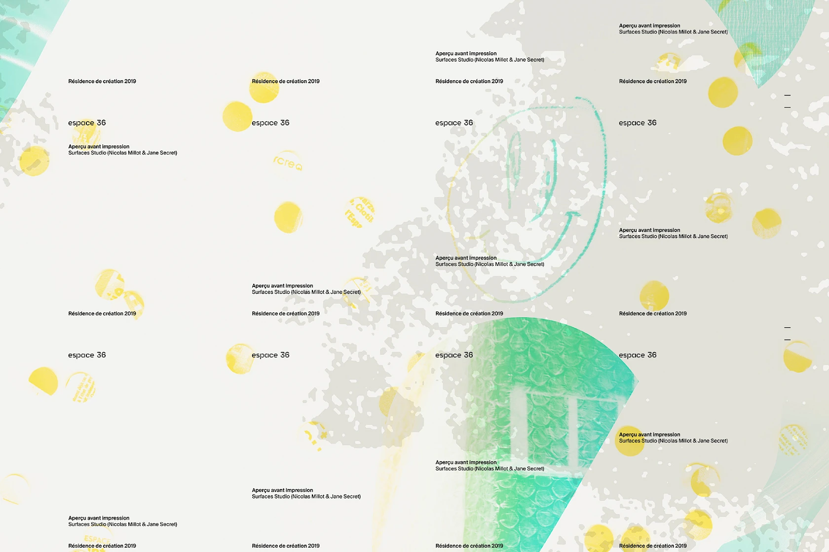
Layers of black ink were added to the poster matrix to produce the communication documents.
For the production of this economically constrained project, we were keen to manage the event’s communications in order to optimise the production process.
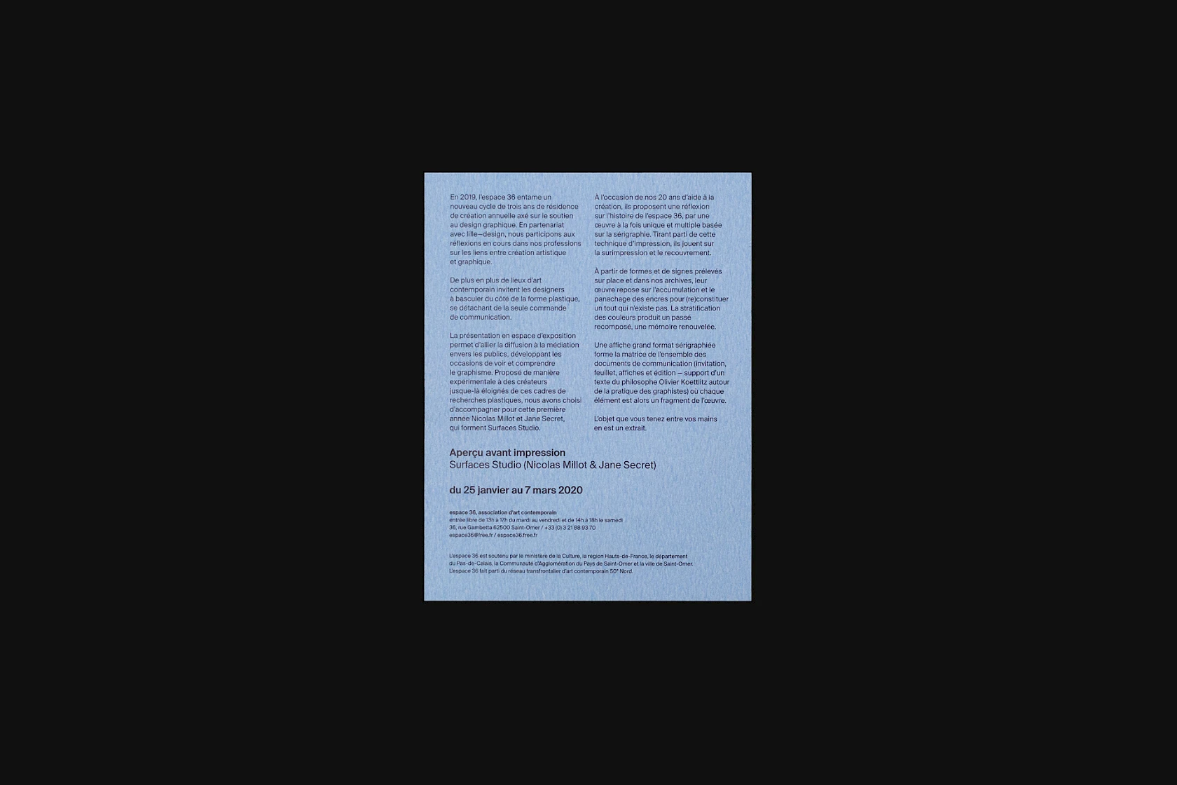
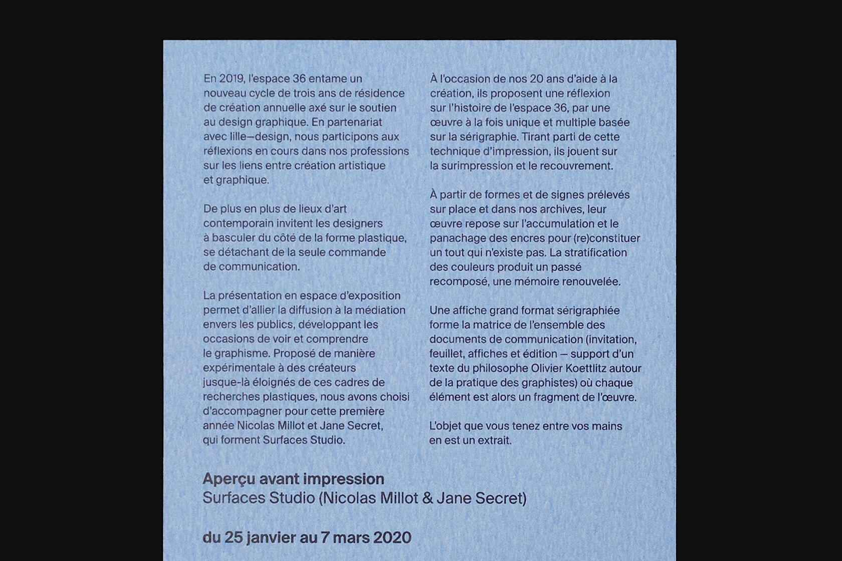
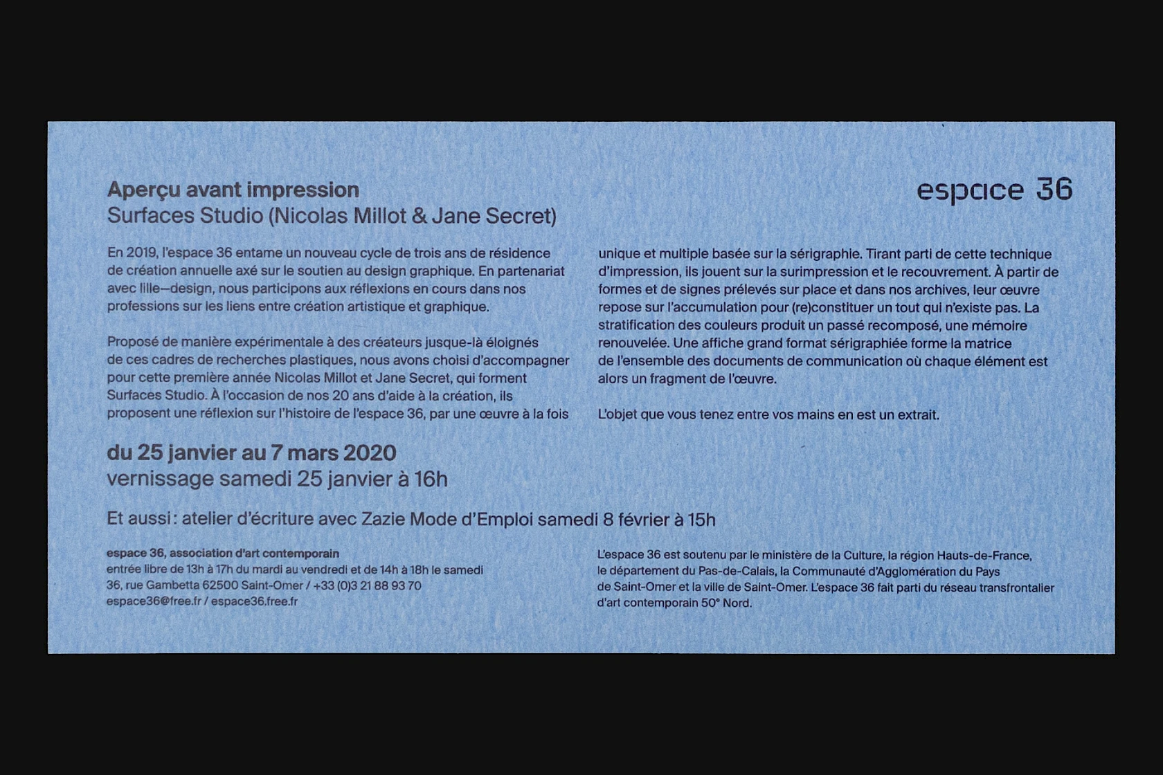
Once the large-format visual had been designed, all we needed to do was apply an extra layer of black ink for each additional document to transform the artwork into communication materials promoting the exhibition. For example, adding a ‘flyers’ black layer enabled us to print 63 copies per sheet.
Printing
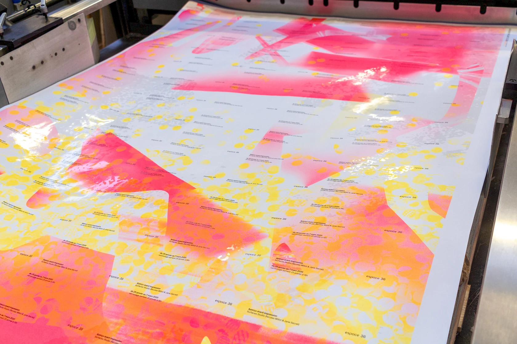
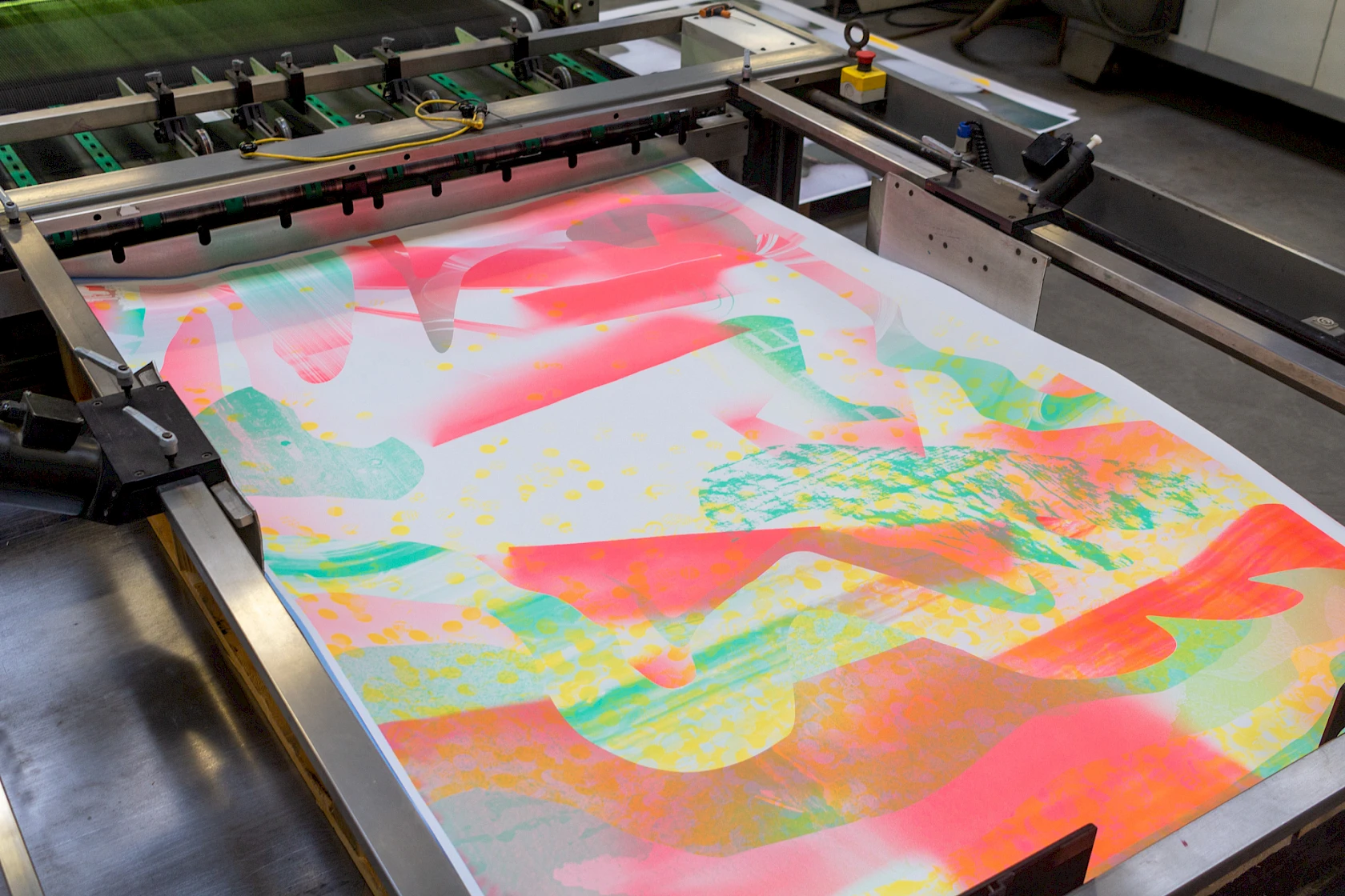
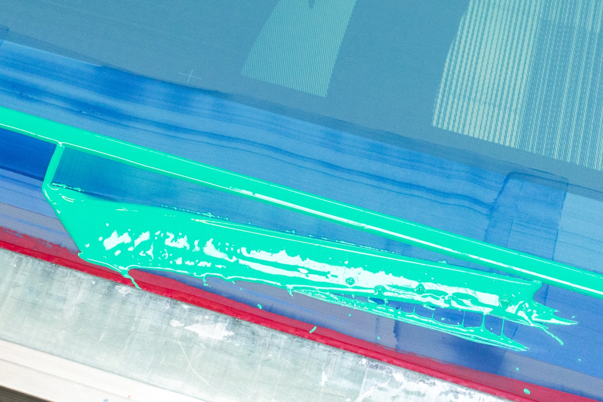
Printing of the project at the Lézard Graphique screen printing workshop.
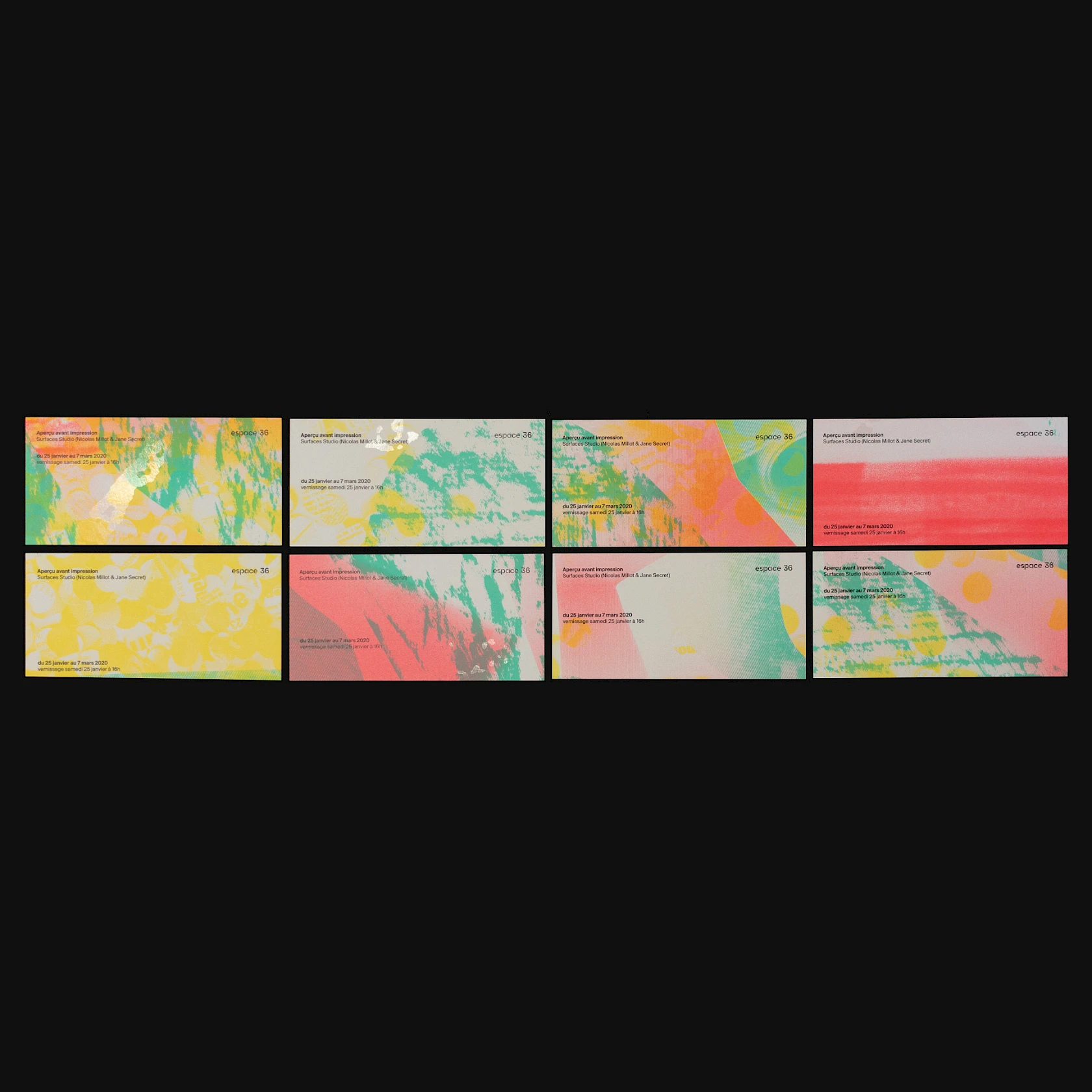
Using 10 silkscreen screens (6 for black inks, 3 for colours, and 1 for varnish), we printed 150 sheets on blue-back paper. By printing in successive layers, we were able to mix and match inks. As a result, the number of inks varies from sheet to sheet, giving rise to colour variations for each printed surface.
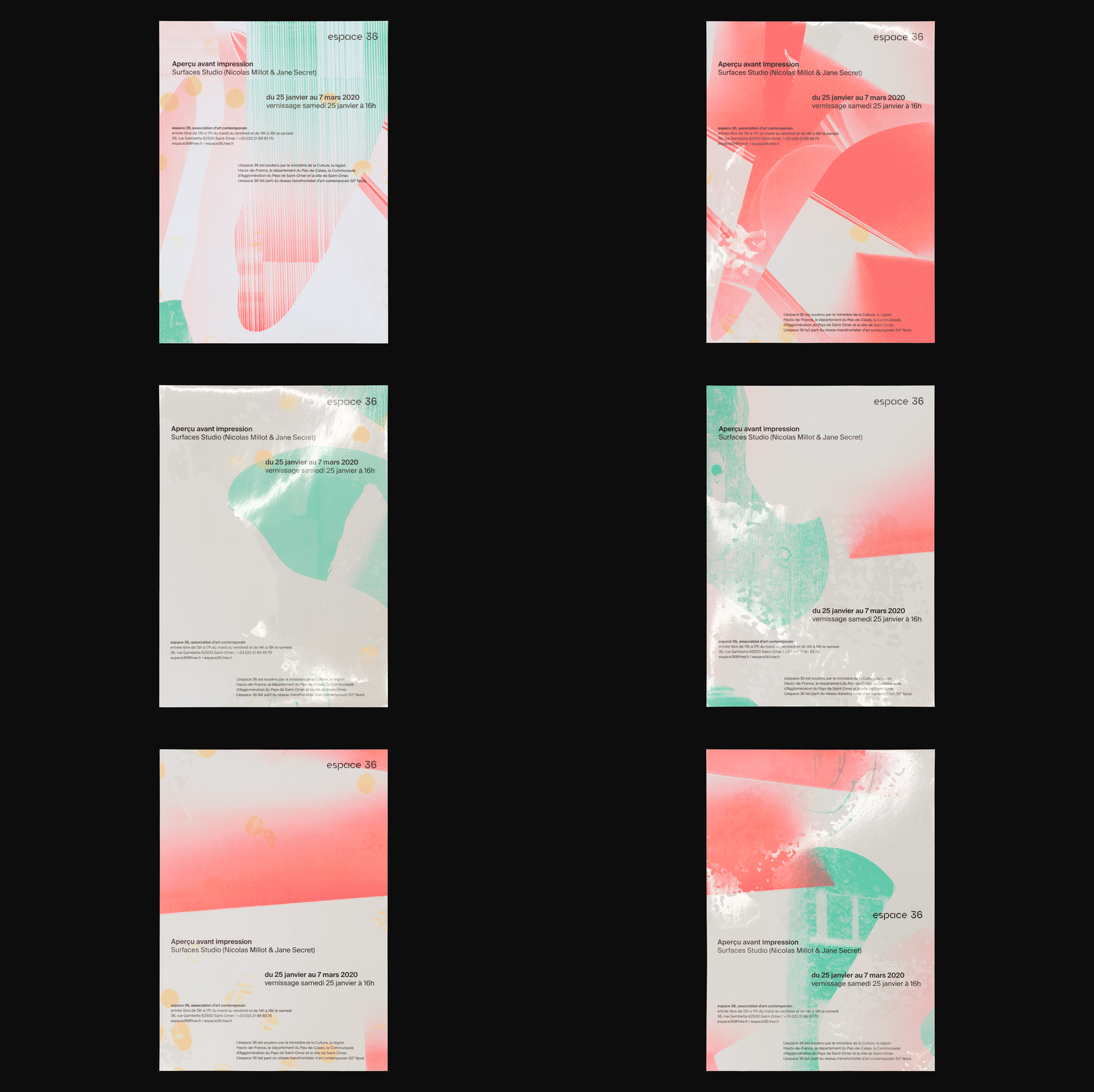
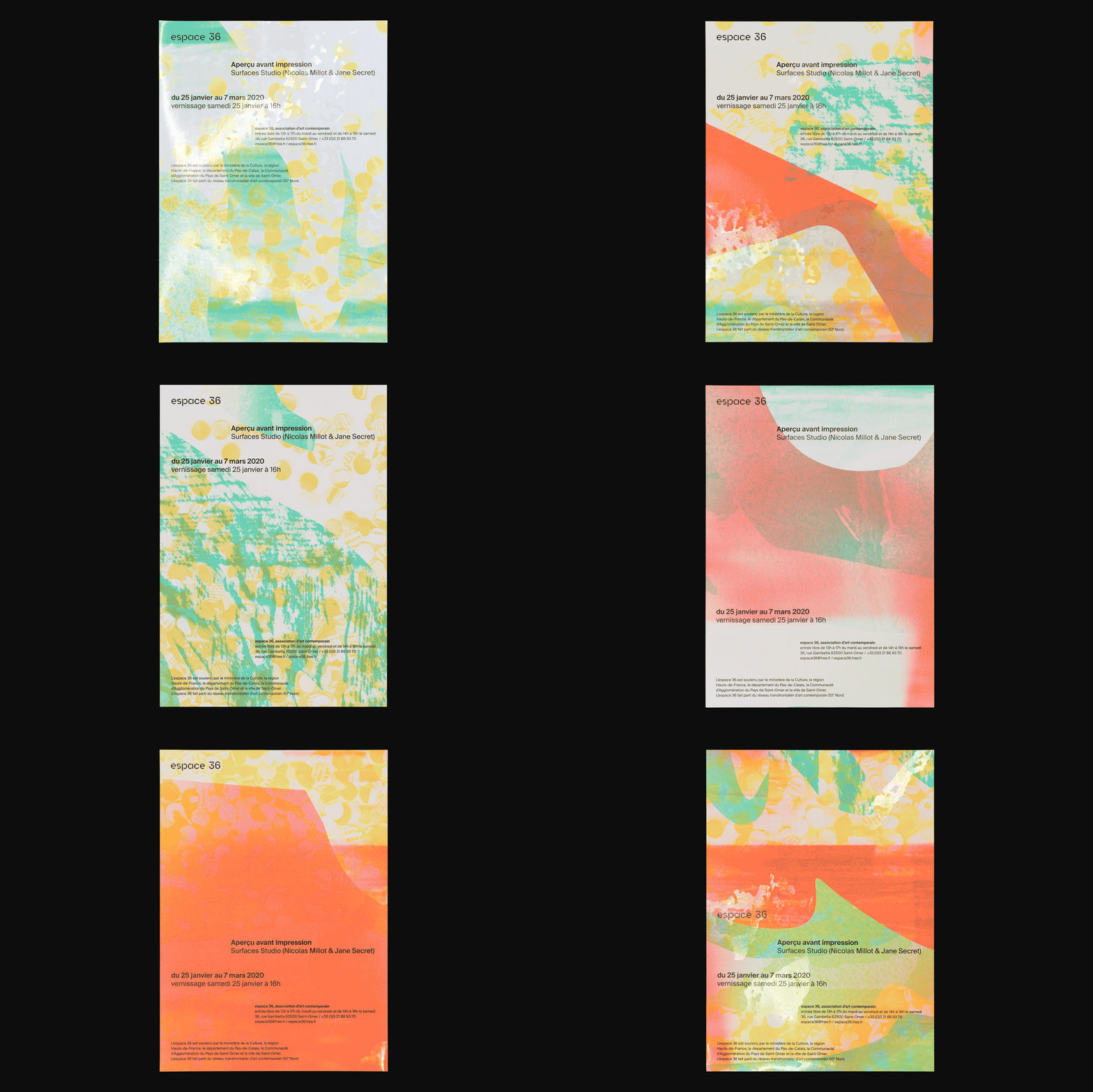
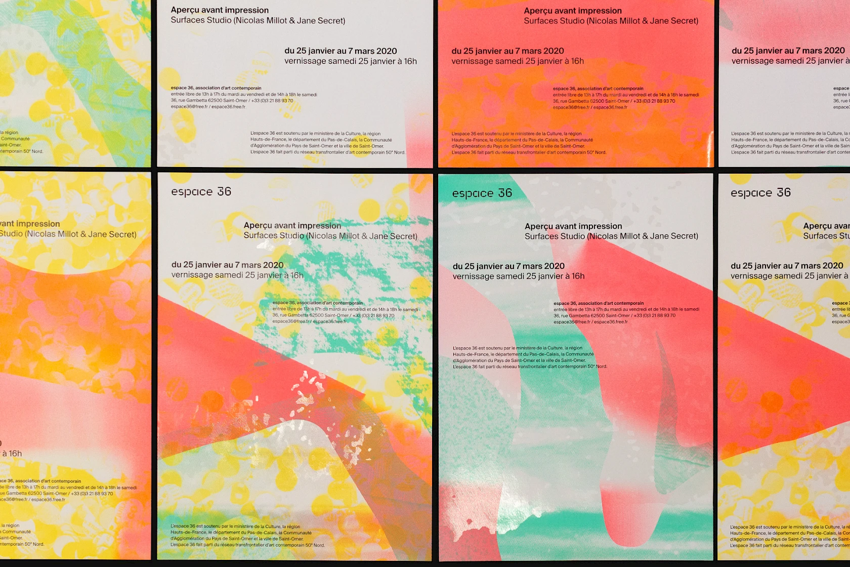
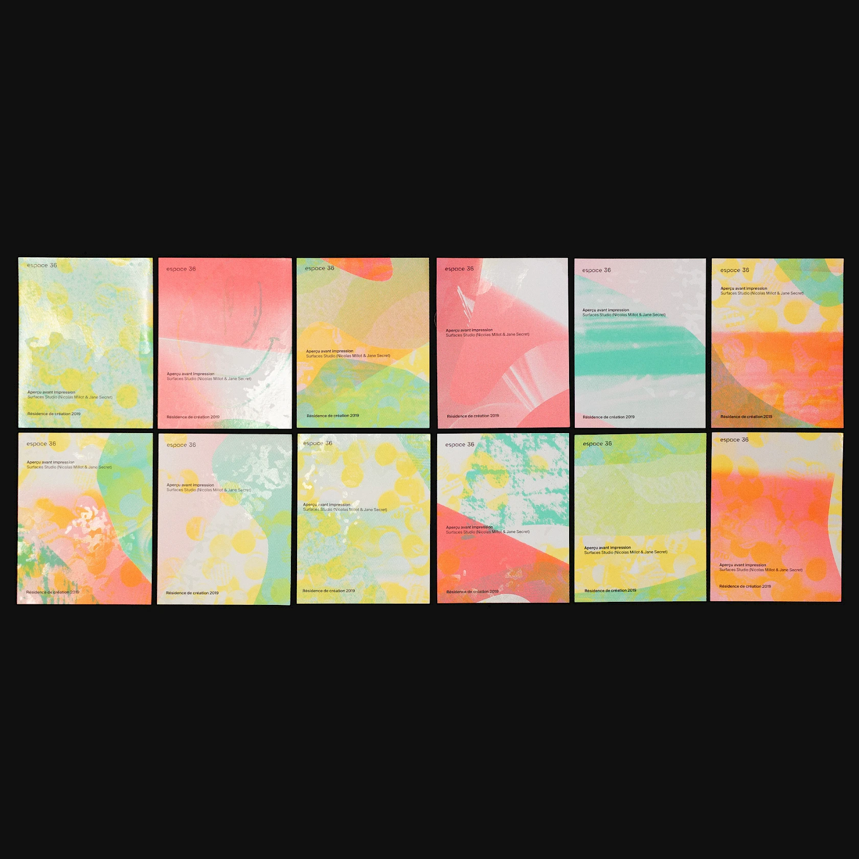
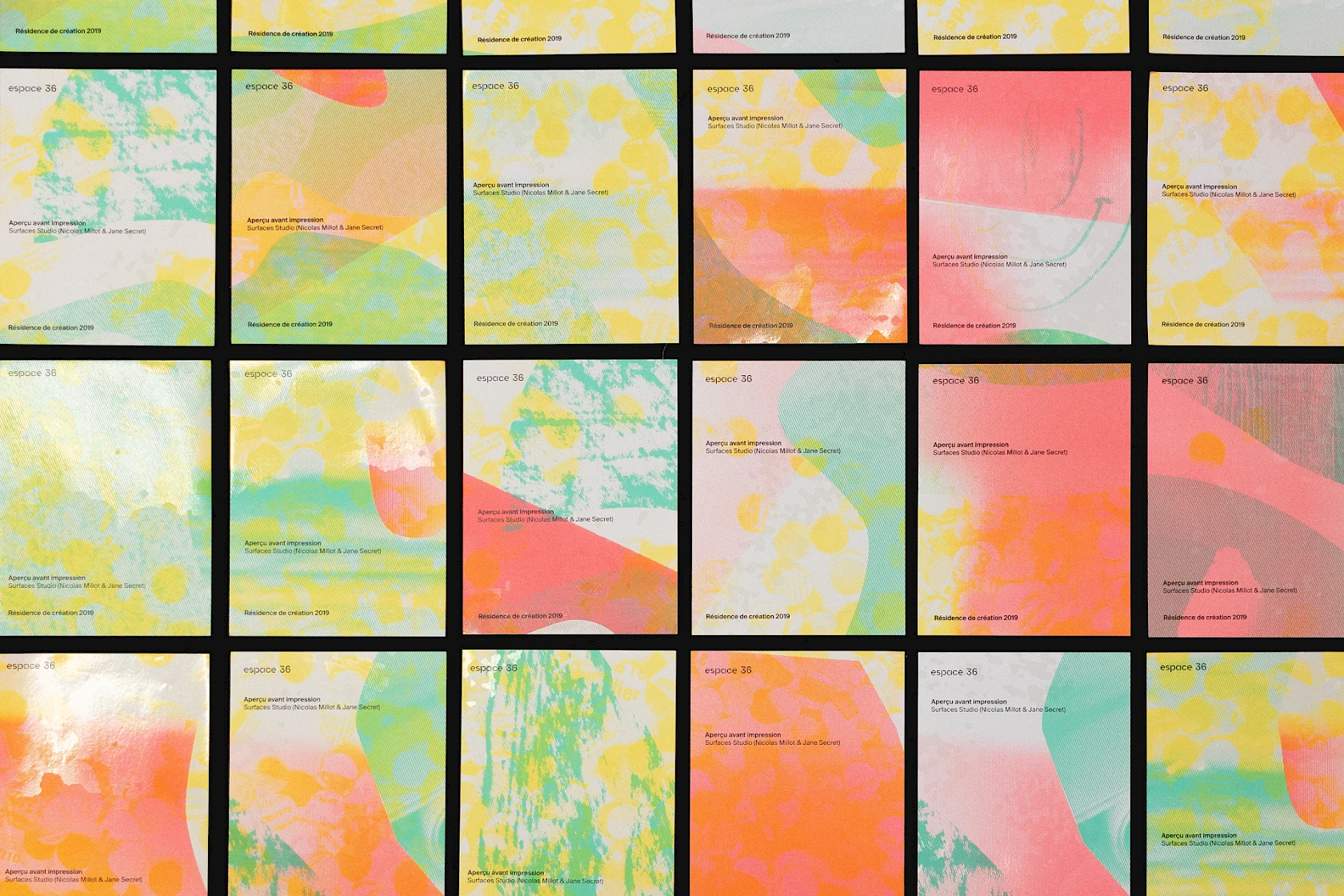
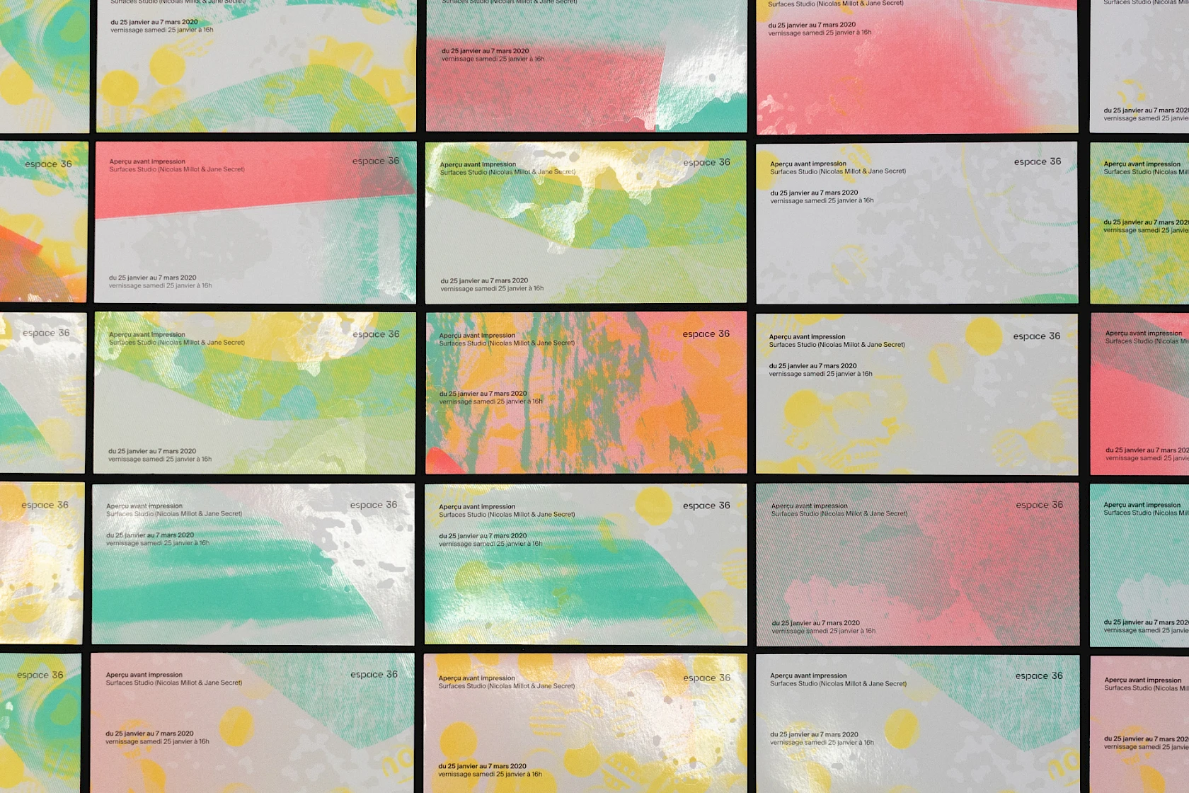
We also used the amalgam technique (placing several documents side by side on the same sheet to optimise printing) to vary the composition of the text blocks. To take a previous example, the flyers (14 × 18 cm) come in 6 different iterations repeated and distributed 63 times across the total surface area of the sheet (118.5 × 175 cm). The resulting 1,260 flyers are almost unique.
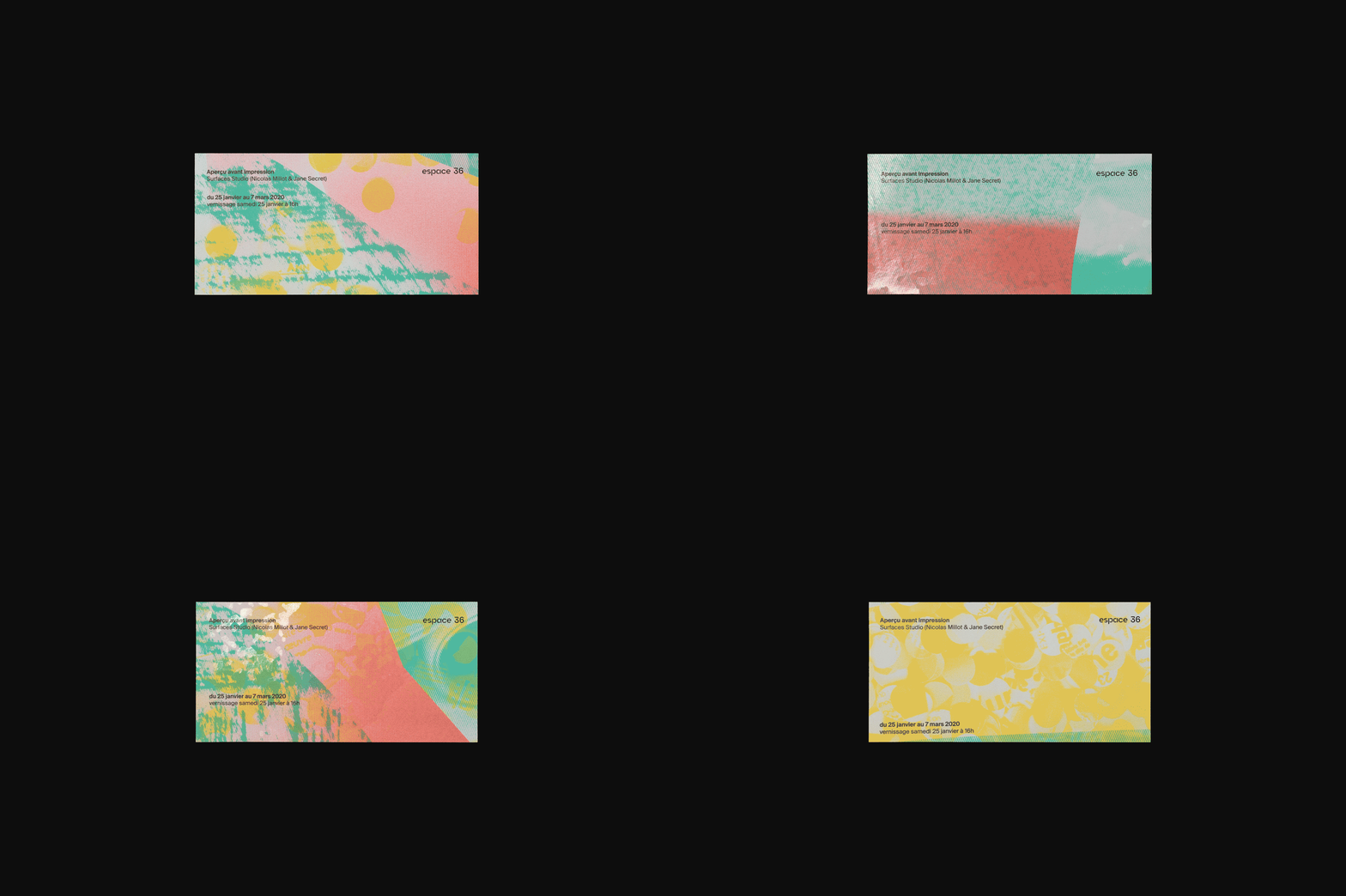
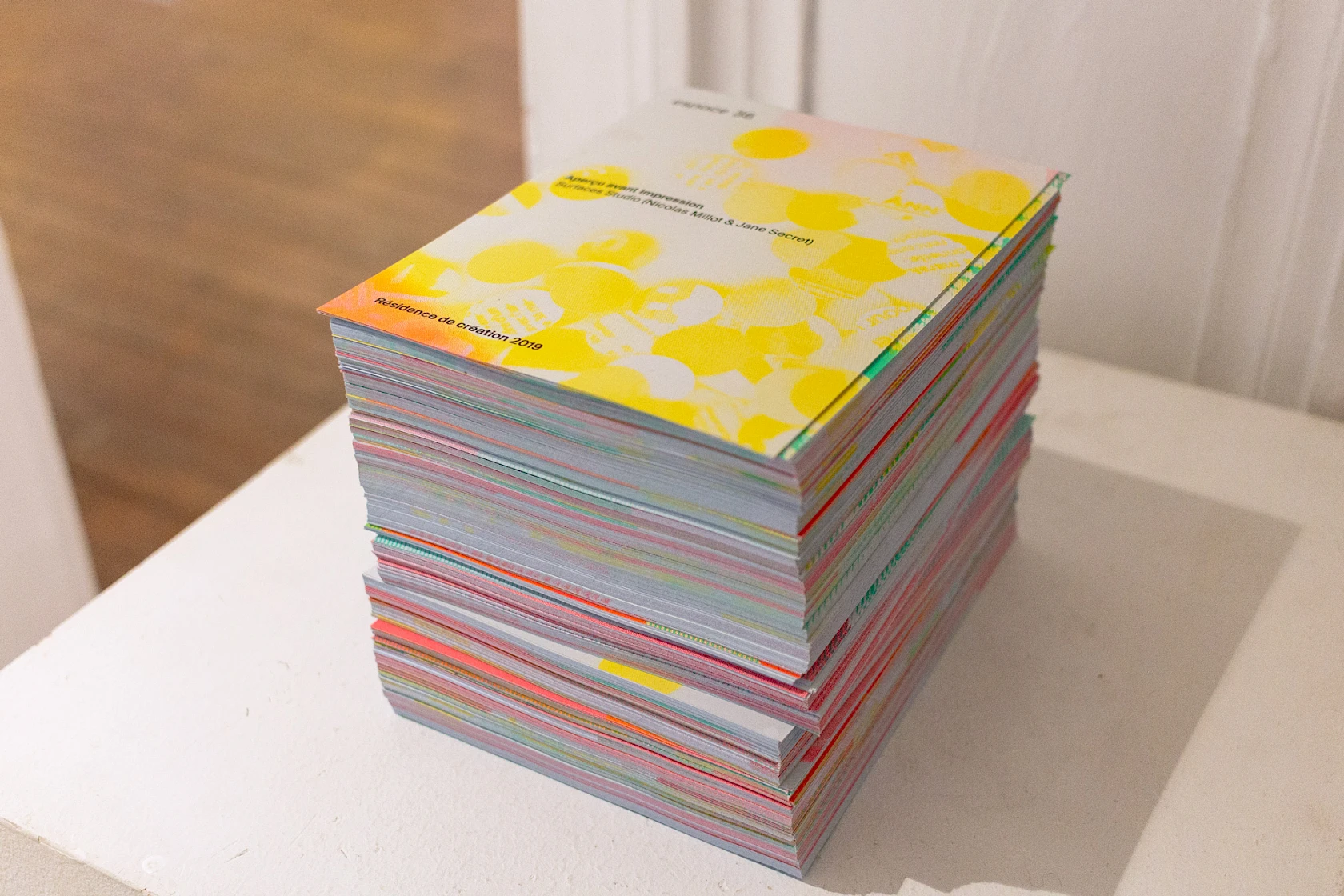
In the end, only 150 sheets had to be printed to produce 2,625 invitation cards, 1,260 flyers, 96 A3 posters, 42 editions, 35 posters measuring 118.5 × 175 cm, and 32 posters measuring 50 × 70 cm.
An edition : Spectrographie
Flatplan of the publication.
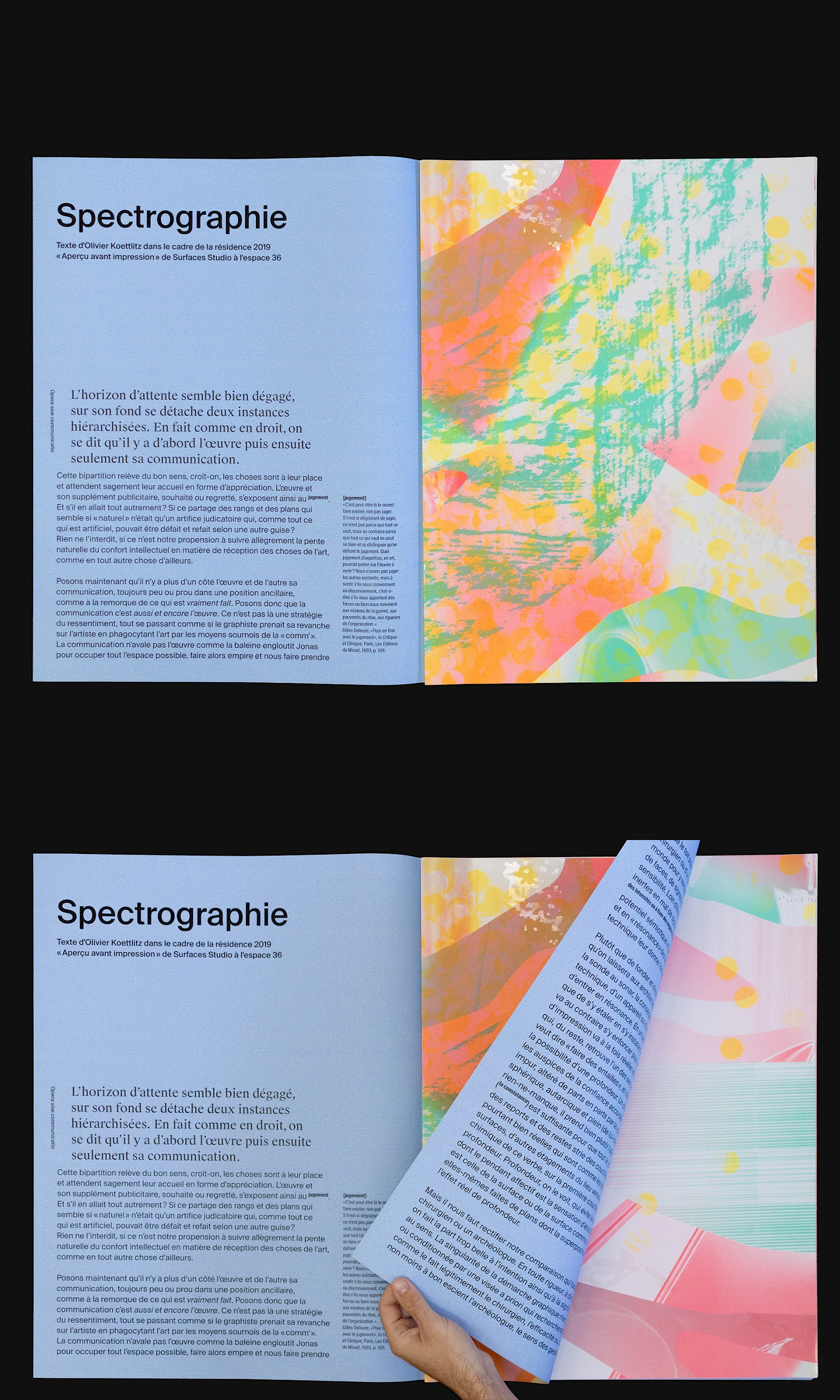
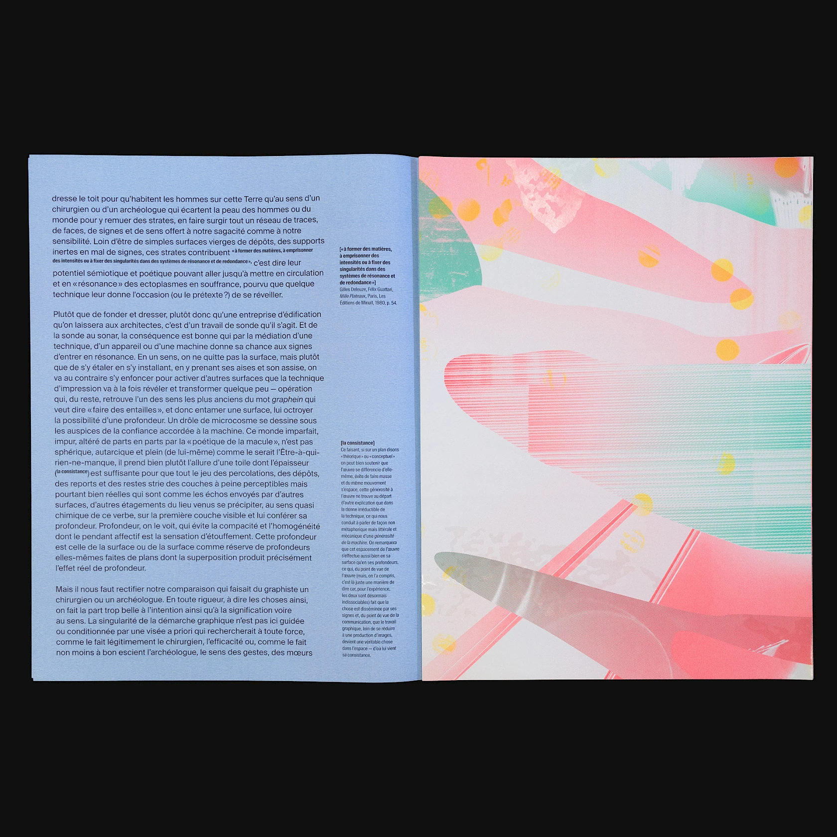
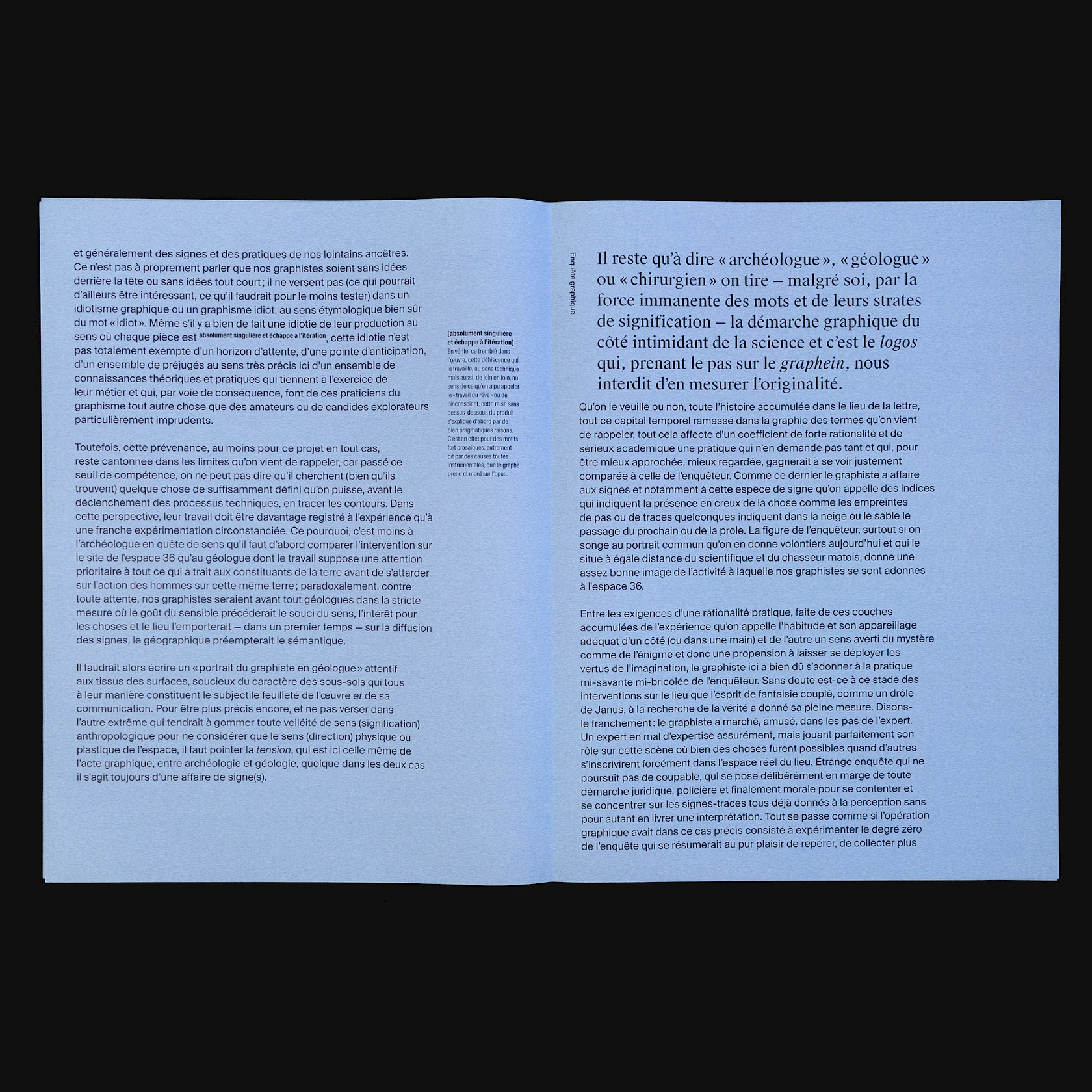
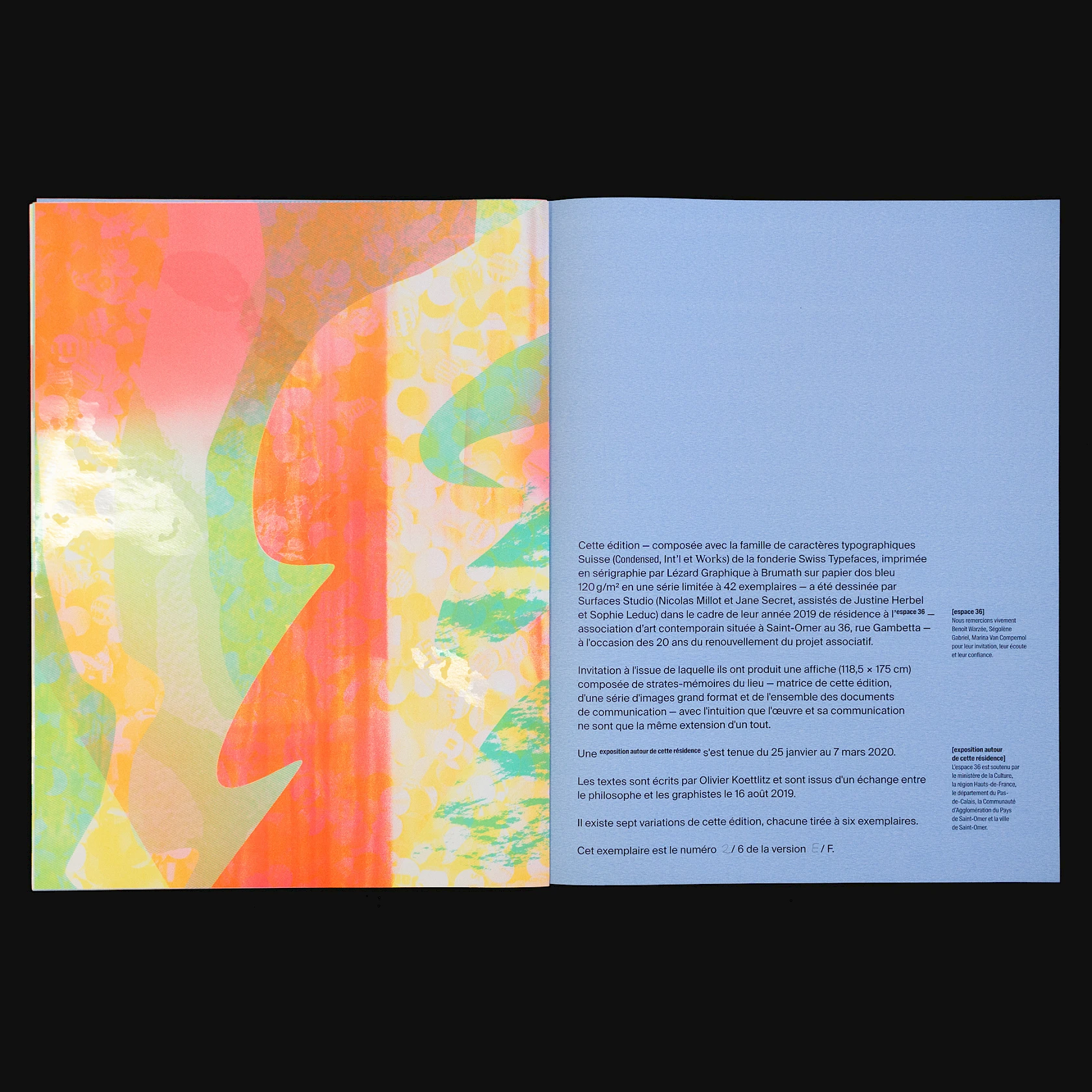
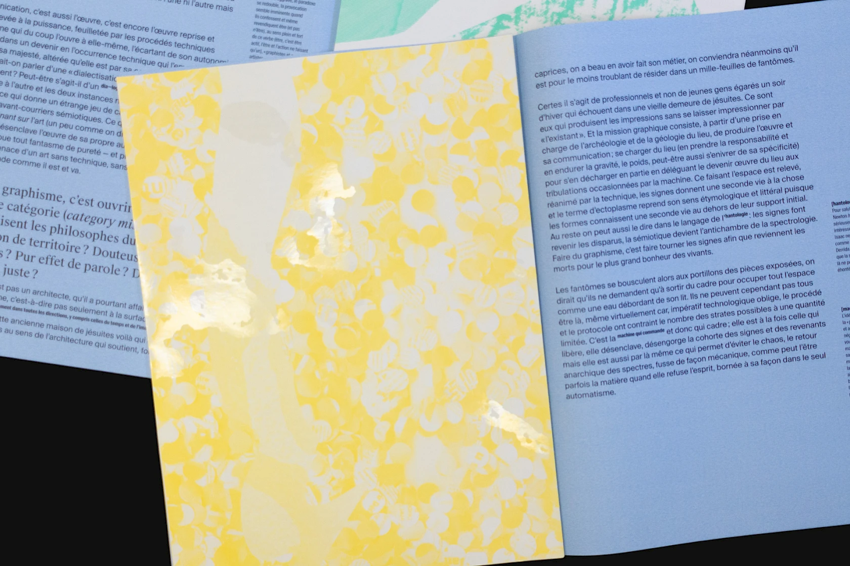
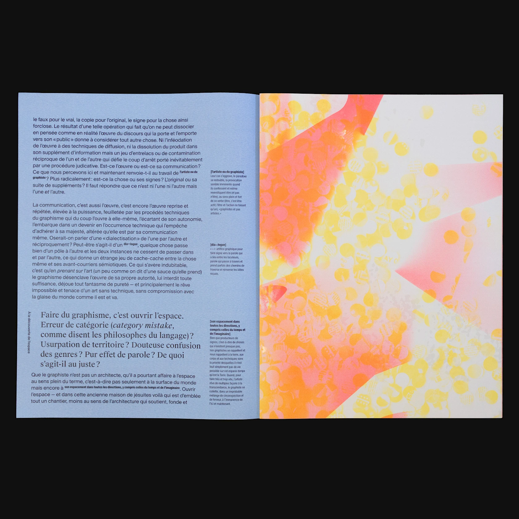
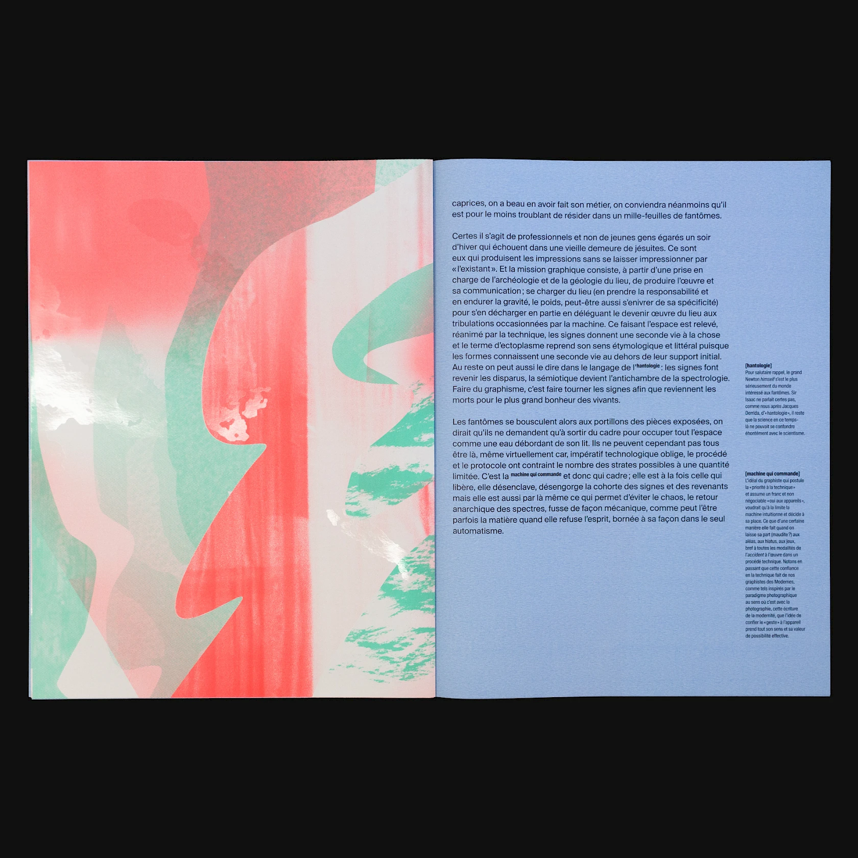
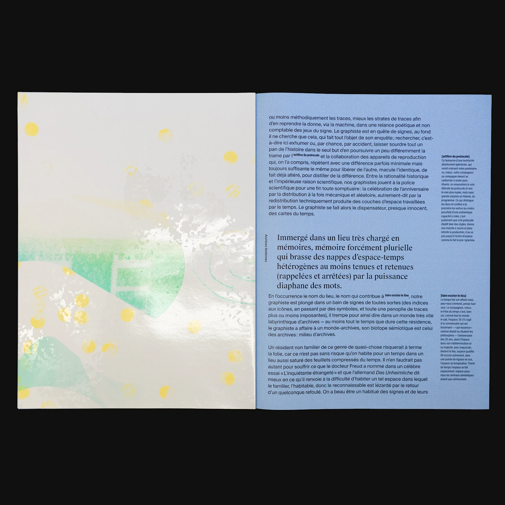
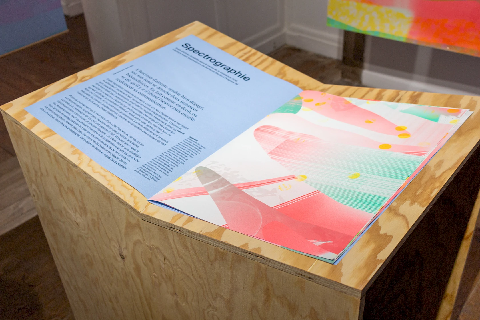
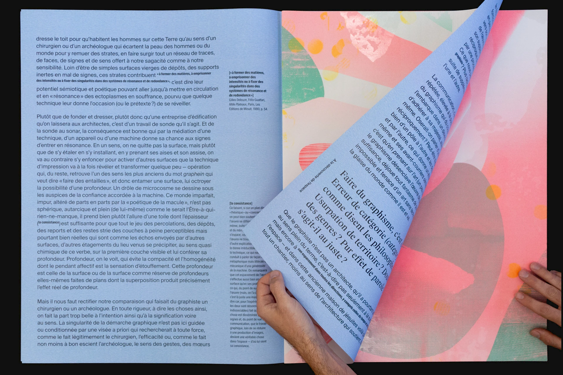
We asked philosopher Olivier Koettlitz to write a text about this project. After an interview in August 2019, he generously offered us a series of four texts related to our questions (as well as others that he spotted in our work). Given this prodigality, we thought it would be a good idea to give concrete expression to it by producing an ambitious edition.
We aimed to continue our exploration of print optimisation by transforming constraints. Rather than filling a large sheet with a smaller format defined in advance (e.g., how many 14 × 18 cm flyers can fit into a Decaux format?), we defined the format of the edition with the intention of covering the entire surface without any loss. The layout was then adapted to this choice, using oversize typefaces that could be read by multiple people in an exhibition context.
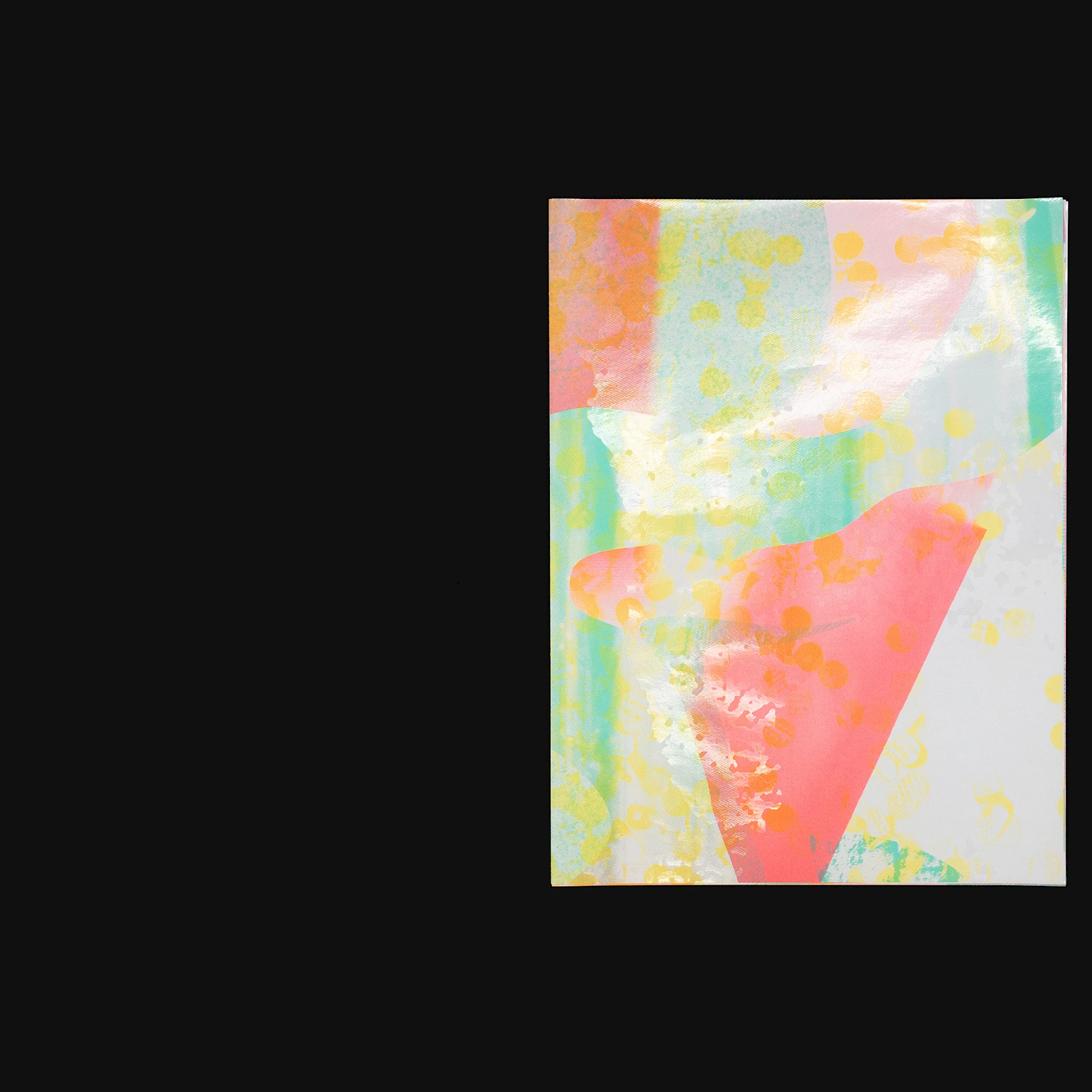
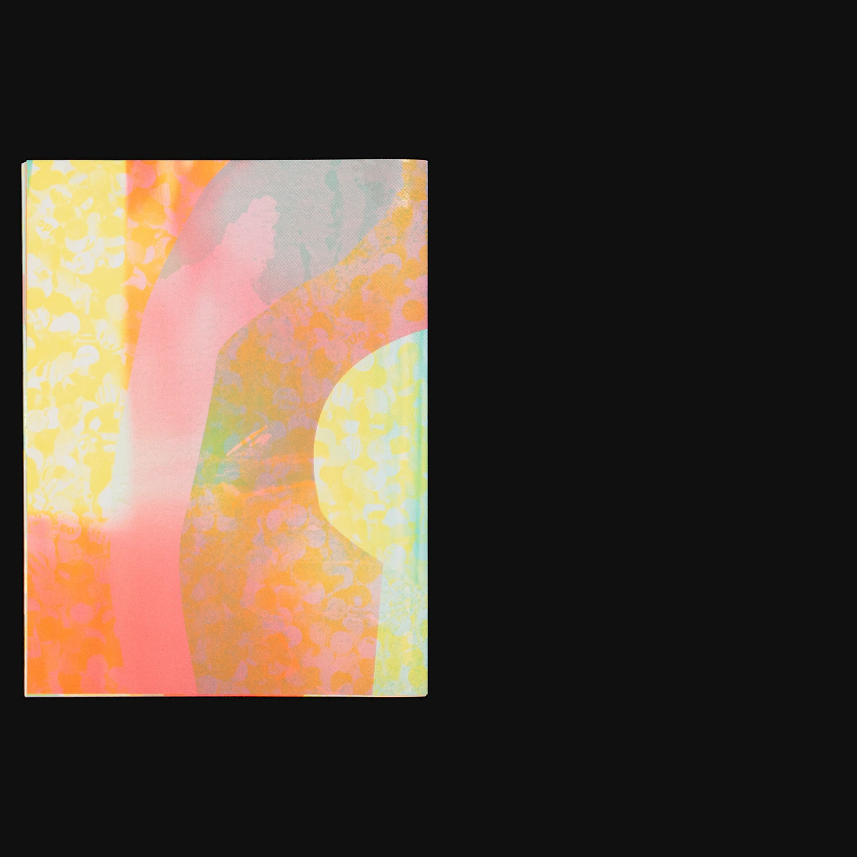
As a result, the original matrix was cut into four pieces which, once folded and inserted, produced a 16-page edition measuring W. 42 × H. 55.75 cm (still the largest editorial object we have designed to date).
Edition variations
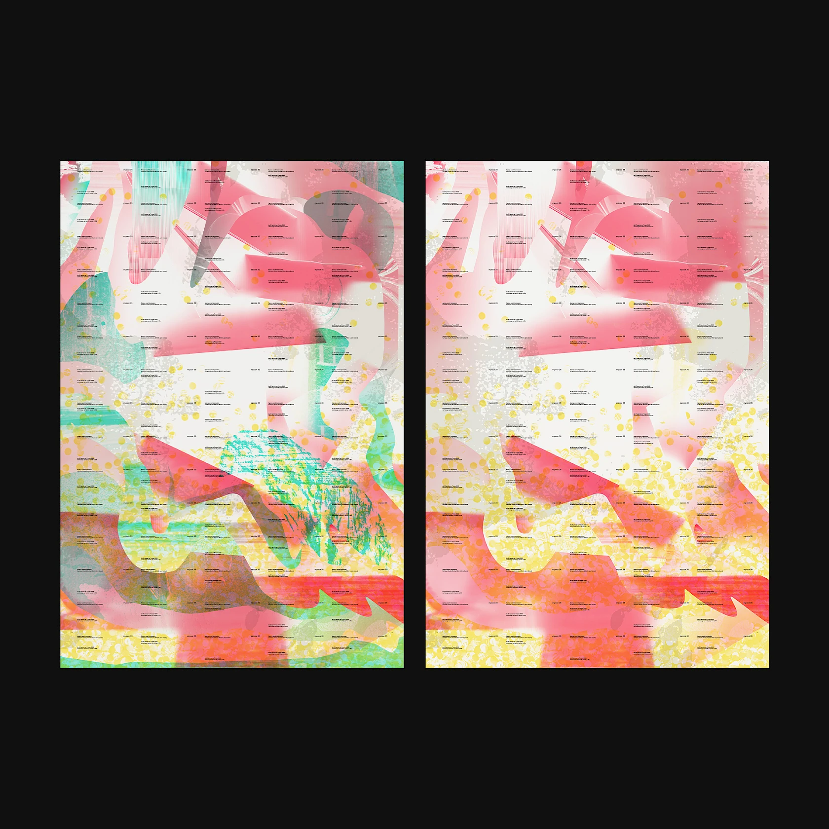
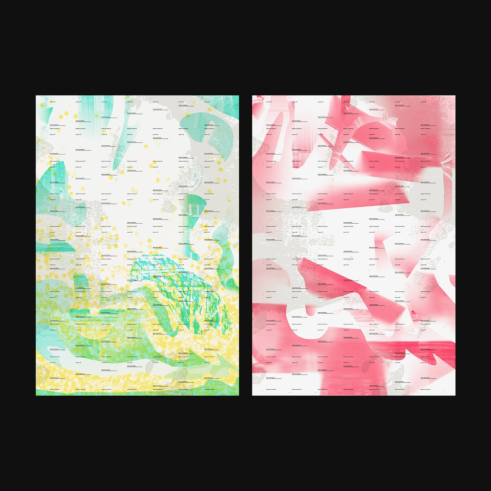
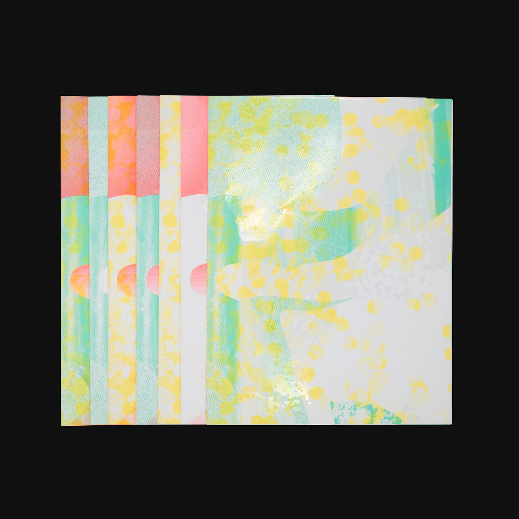
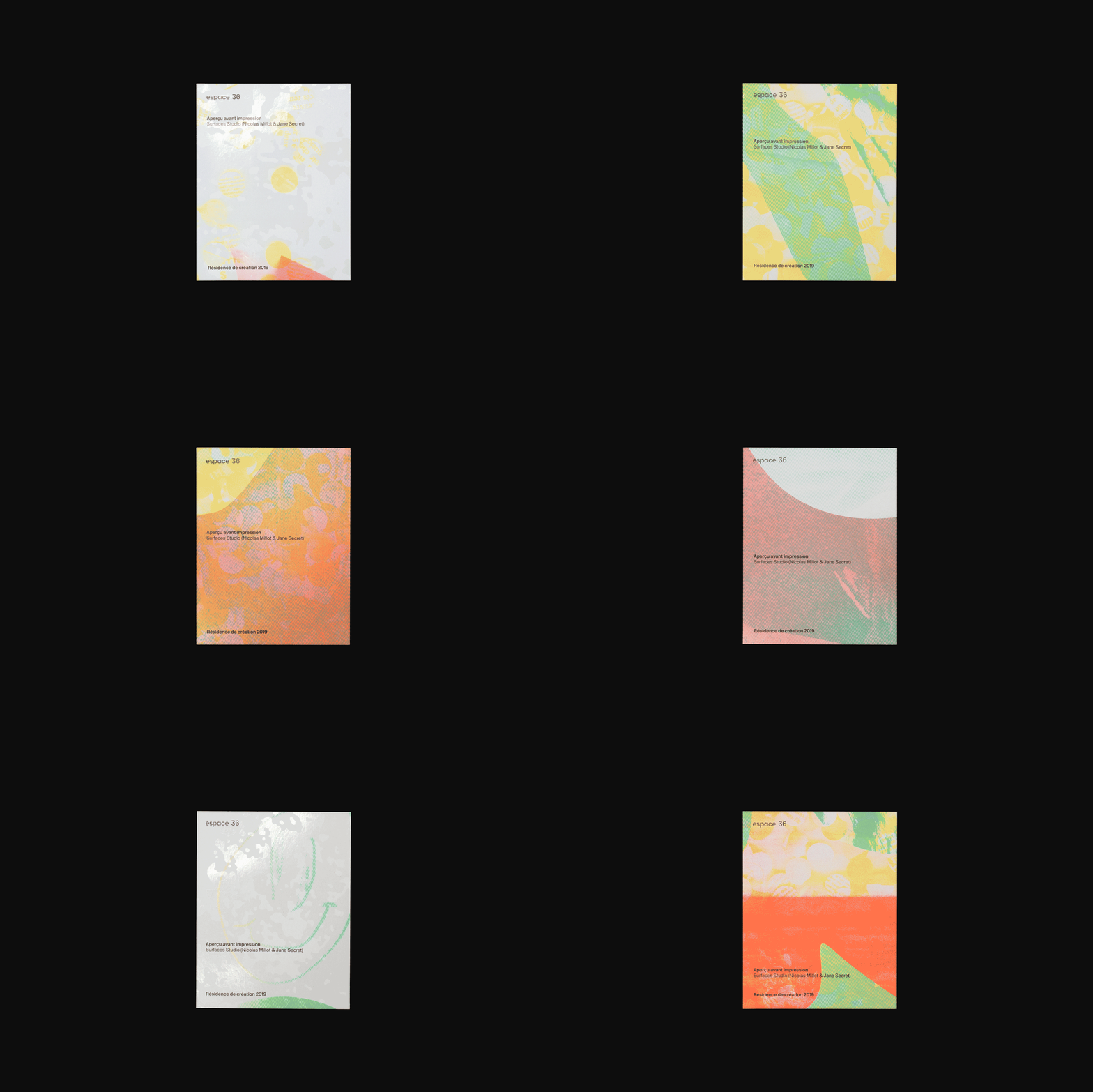
As with all our documents, the principle of mixing and matching is applied to all publications. There are 7 different versions, each printed in 6 copies, resulting in a total of 42 documents.
118.5 × 175 cm posters
The 7 variations of Decaux formats (118.5 × 175 cm).
50 × 70 cm posters
Overview of the 32 posters measuring 50 × 70 cm.
A3 posters
Overview of the 96 A3 posters (based on 12 variations of text block compositions).
Flyers
Overview of the 1,260 flyers (based on 6 variations of text block composition).
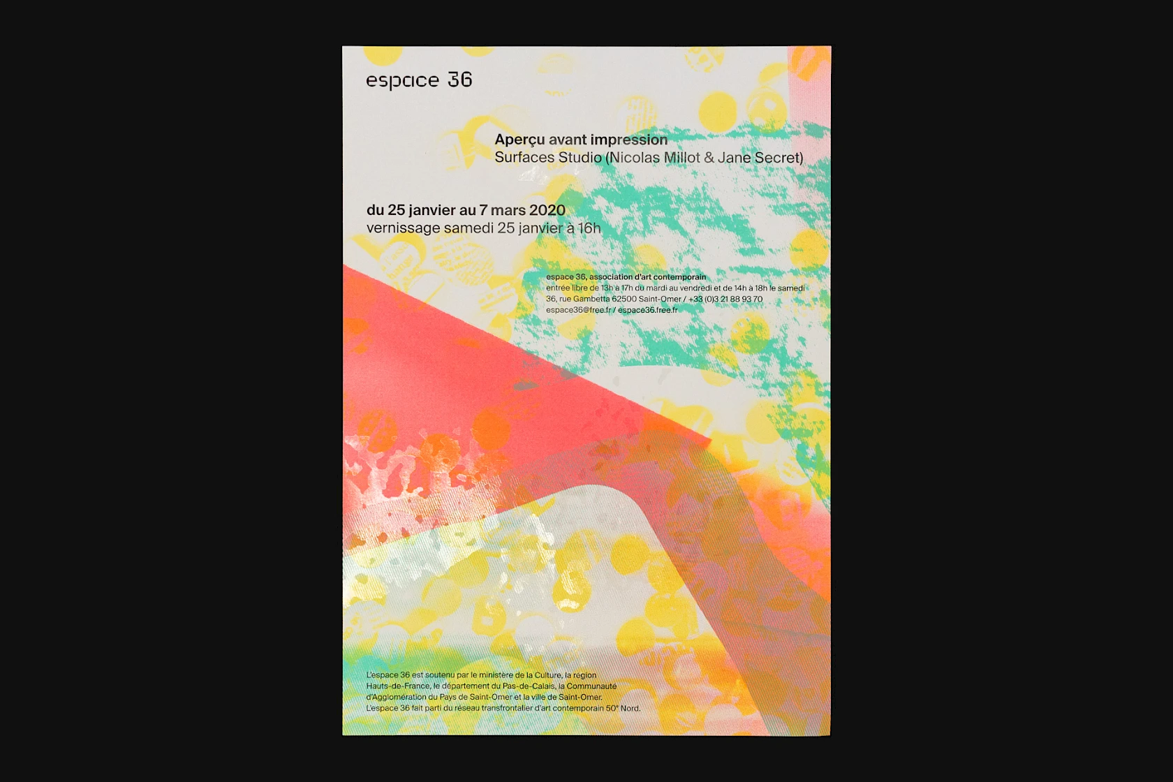
Invitation cards
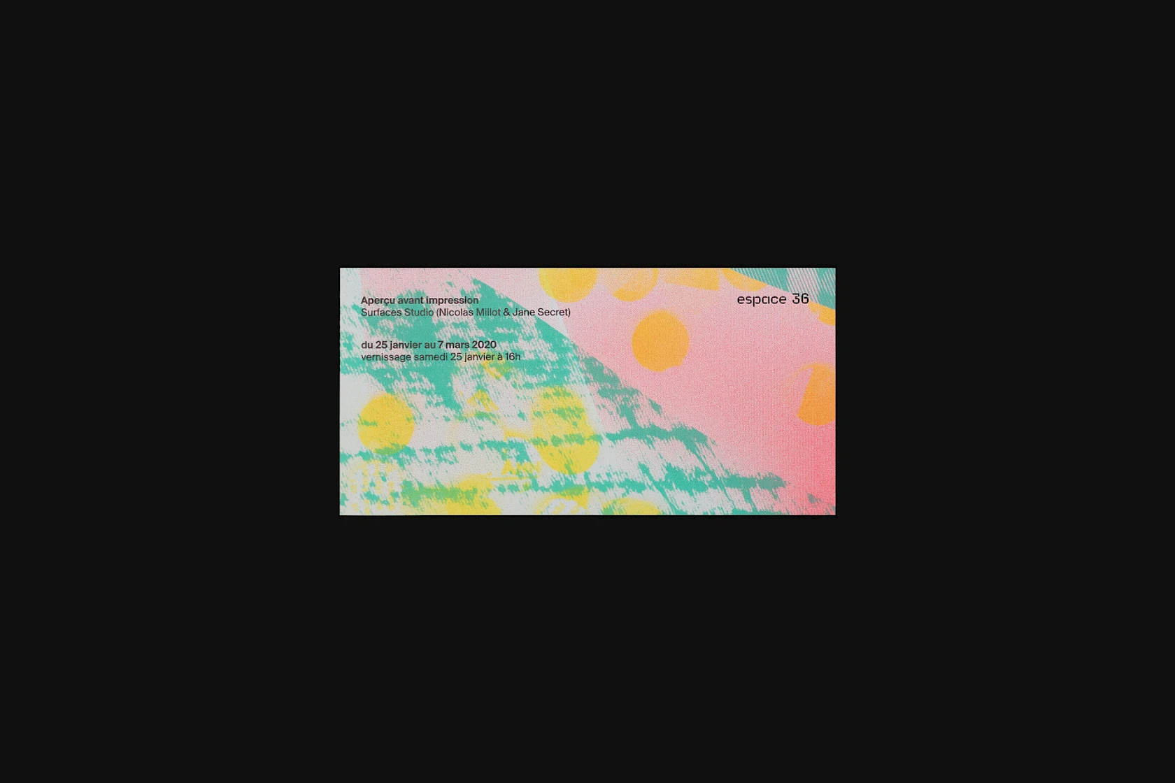
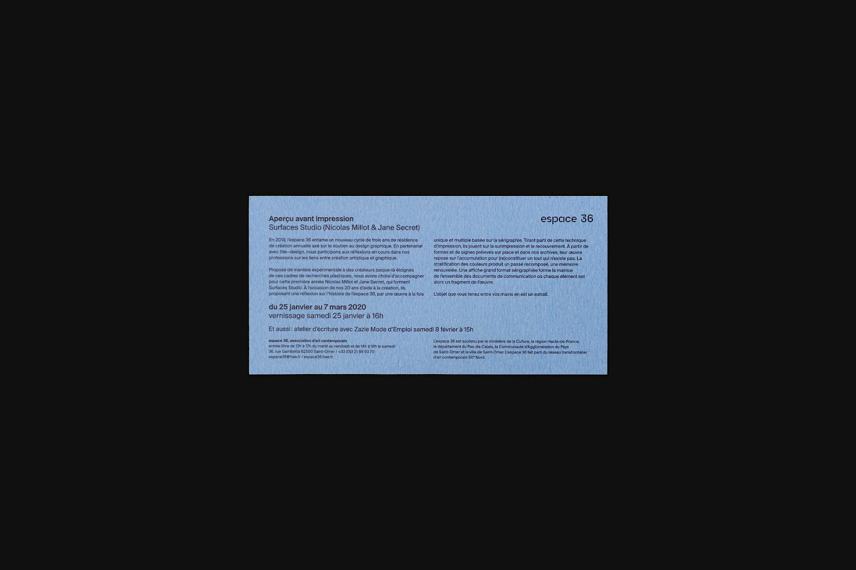
Overview of the 2,625 flyers (based on 4 variations of text block composition).
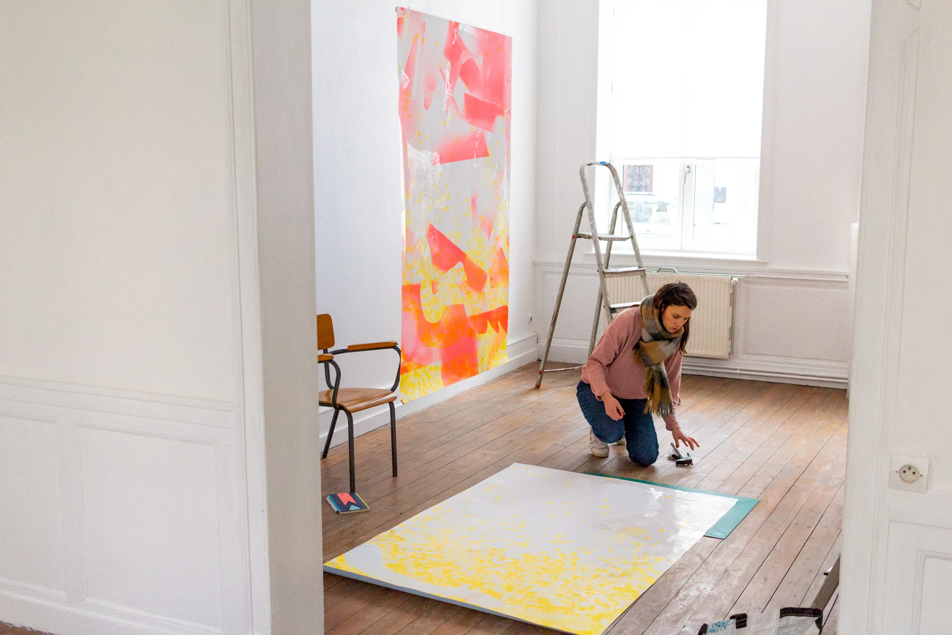
Exhibition
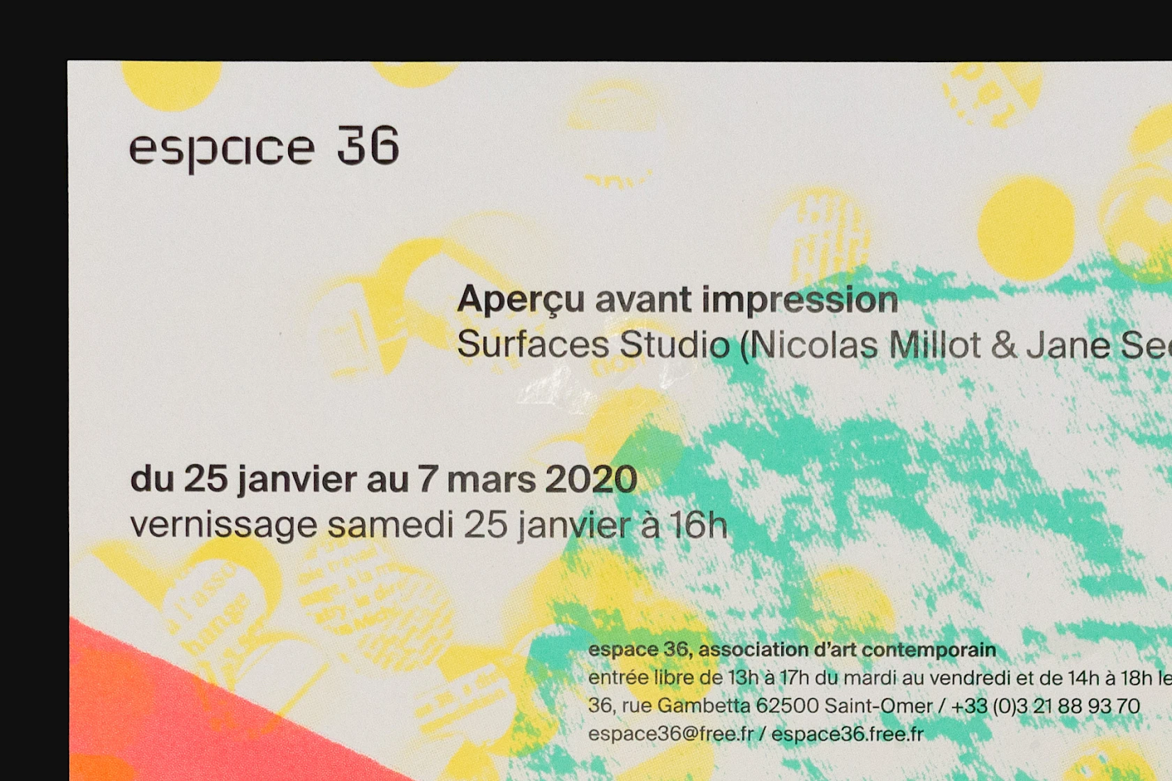
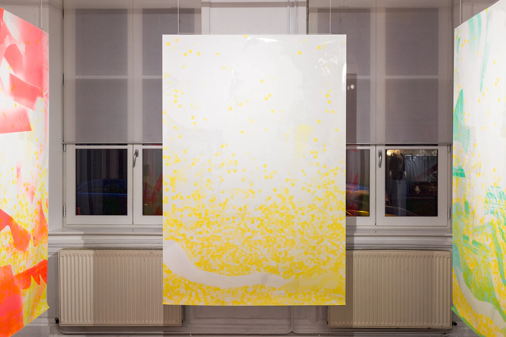
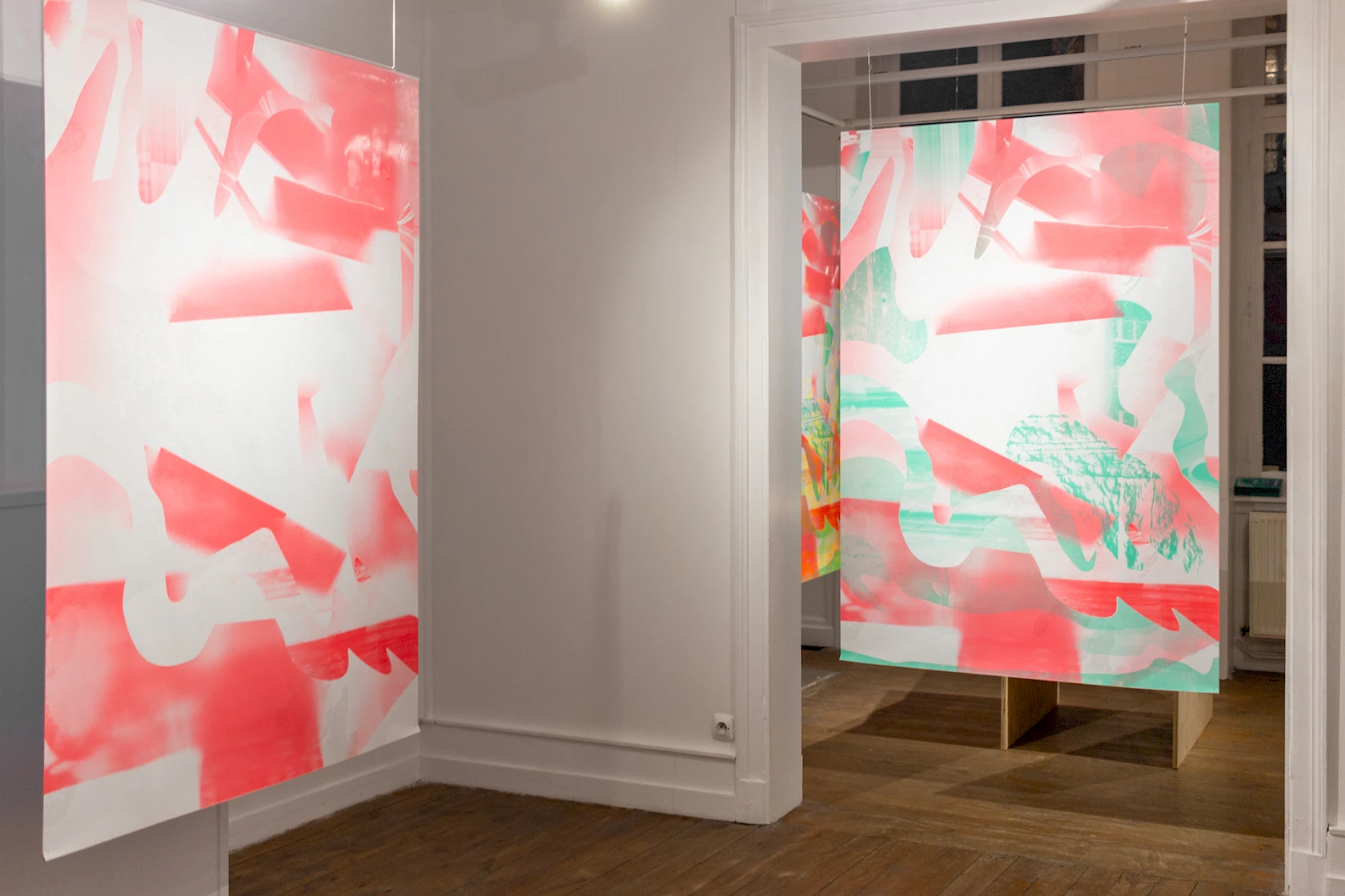
Views of the exhibition Aperçu avant impression (Print preview) presented from 25 January to 7 March 2019, which concludes our residency at espace 36.
- Client
- espace 36 (5)
- Field
- Medium
- Feature
- Combinatorial principle (17)
- Mix and match (5)
- Non-standard shaping (13)
- Optimisation (6)
- Silk-screen printing (16)
- Singular format (4)
- Spot colour and Technical ink (45)
- Technical experimentation (12)
- Variable formats (15)
- Varnish (3)
- Year
- 2020
- More info
Thanks to Ségolène Gabriel, Marina Grebert, Justine Herbel, Olivier Koettlitz, Sophie Leduc, Paul Tahon, and Benoît Warzée, along with the Lézard Graphique team.
Video: Paul Tahon.
